Hayloft Studios
The world is barreling forward at the speed of light—more choices! greater progress! faster speeds!—and whether you like the speed or not, it creates a market for businesses that offer to transport you to slower times.
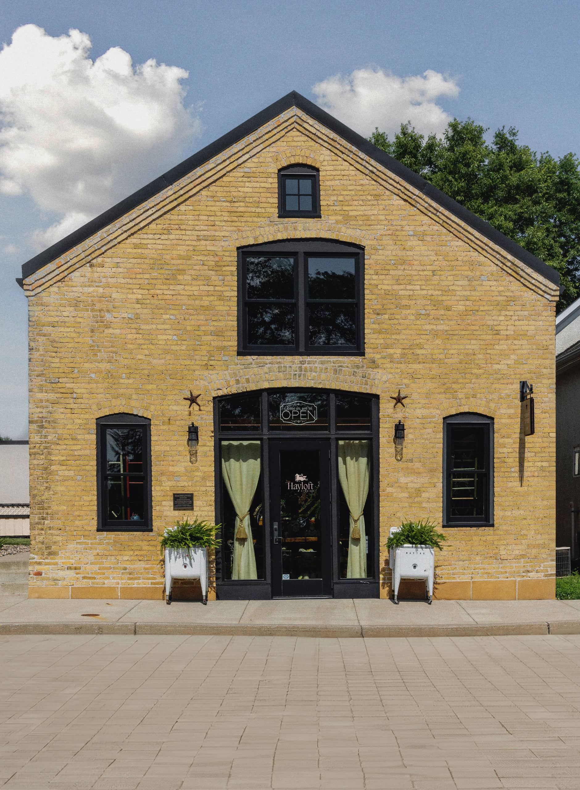
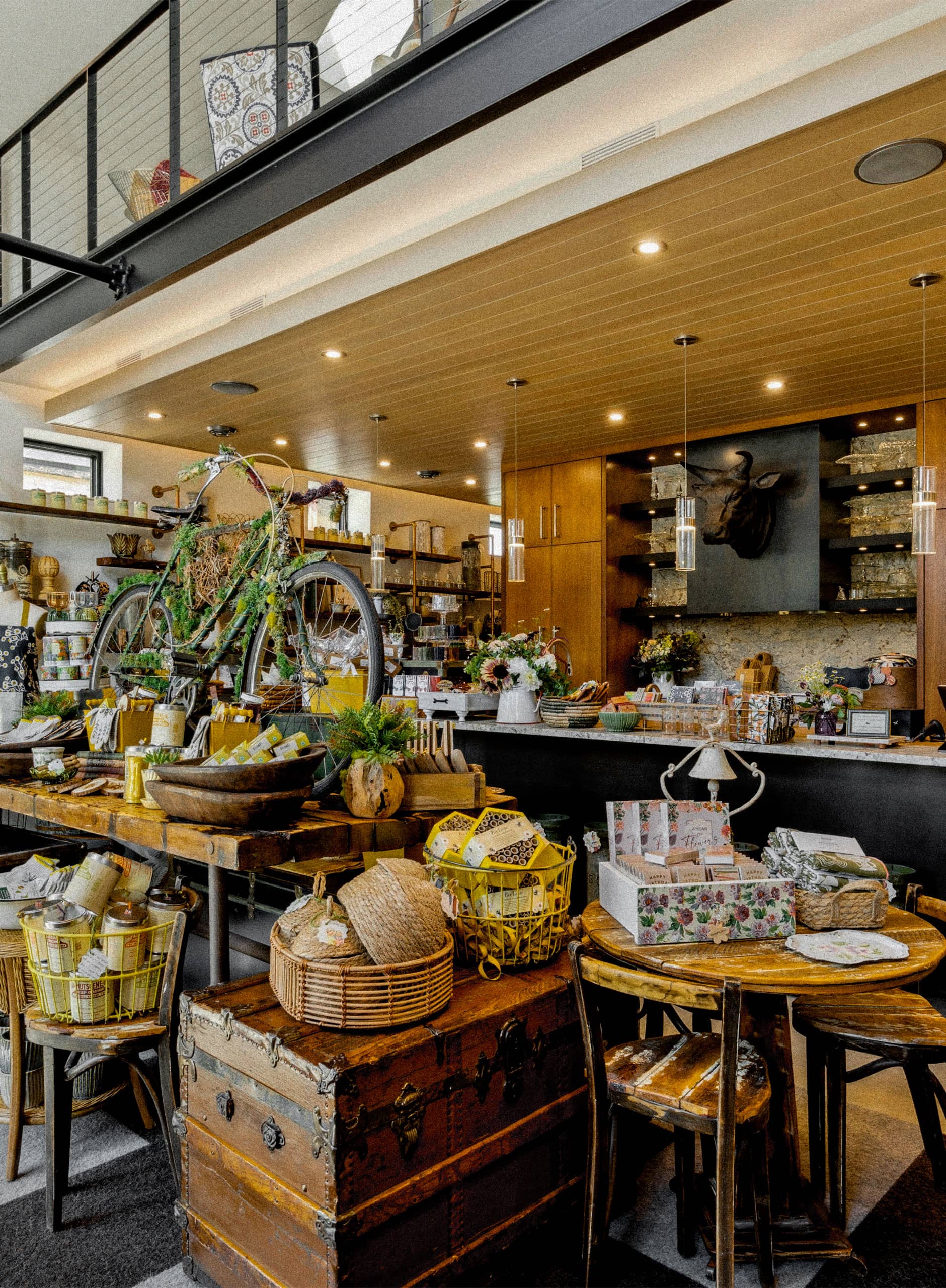
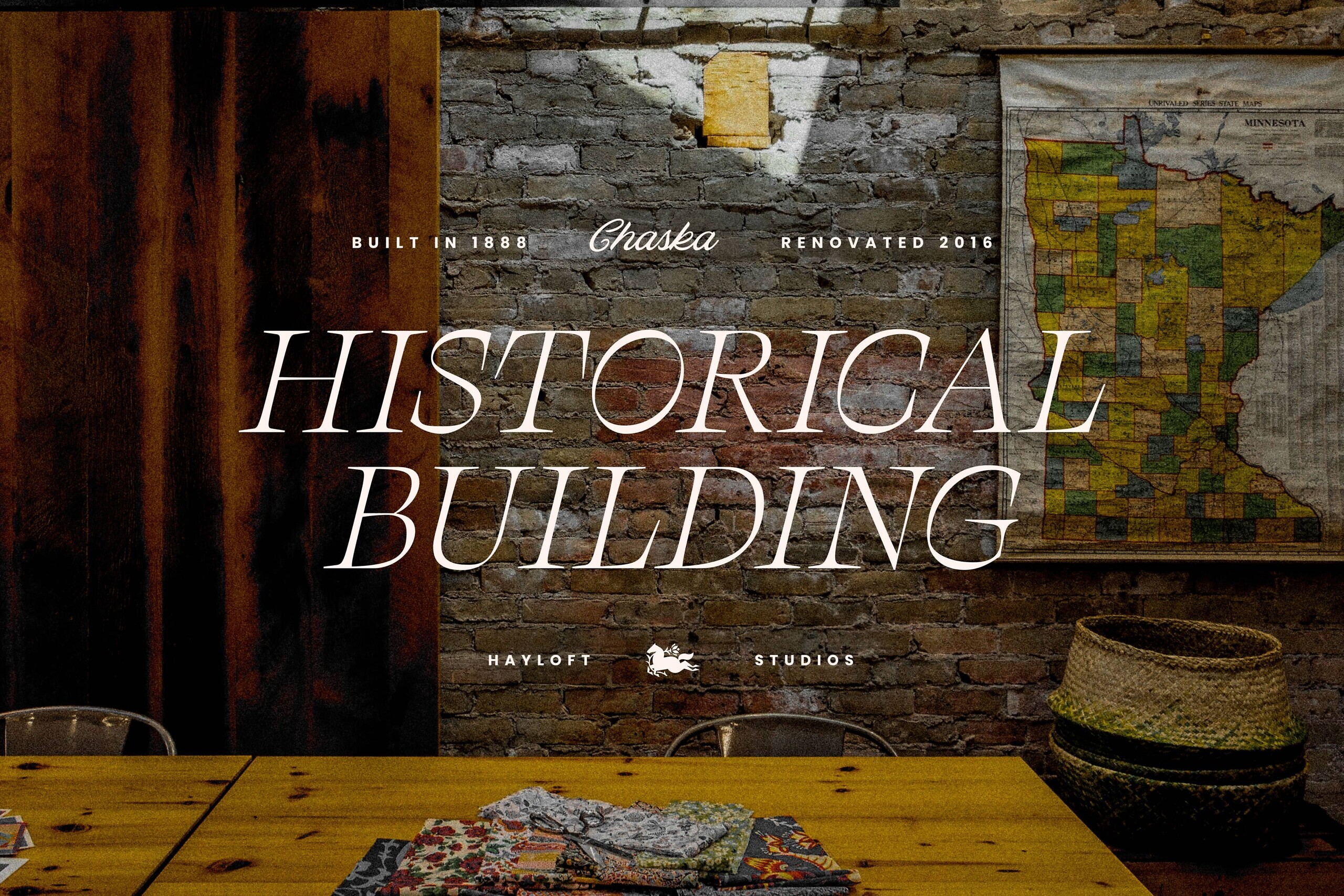
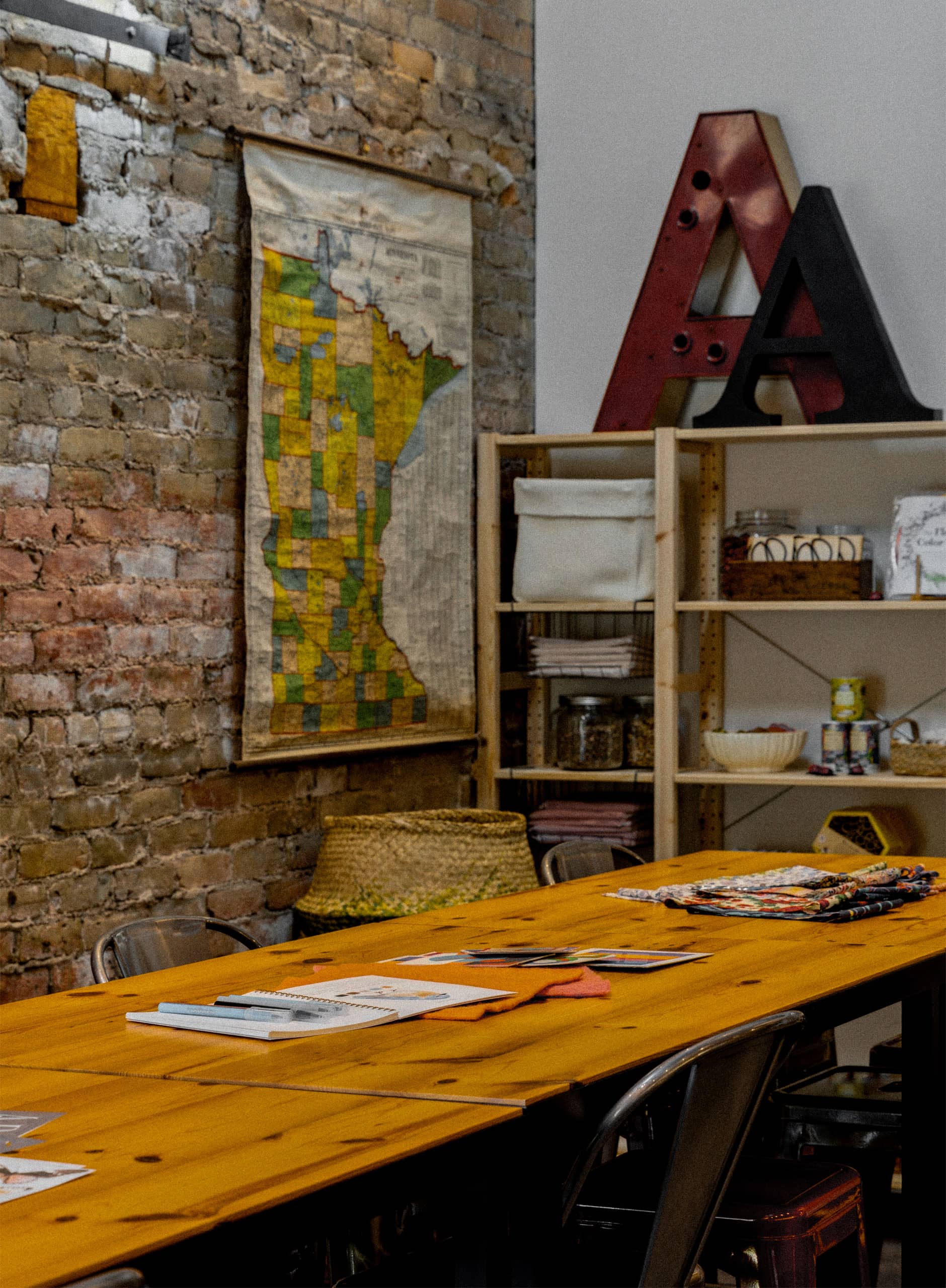
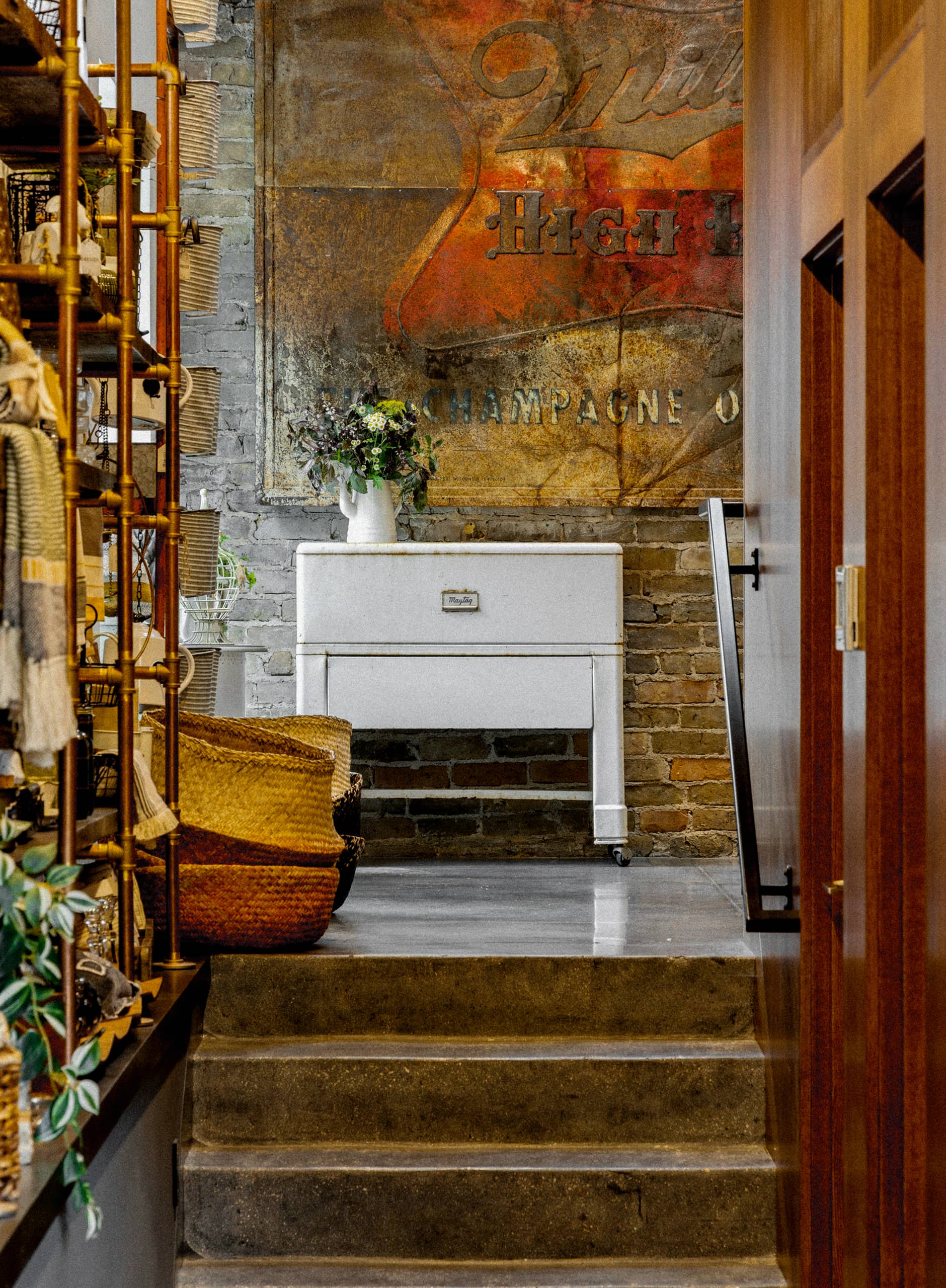
The Simons Livery Stable was built in those times, all the way back in 1888, when figuring out where to park the horse when you went into town was one of your biggest problems. And with exposed brick and an open layout, our friends at Hayloft Studio seized on the opportunity to renovate a historic treasure into a contemporary retreat, an elevated retail experience that fuses together the old with the new.
Make. Shop. Gather. Hayloft is all about creating space for people to find solace in slowing down. In their award-winning studio, you can shop for exceptionally-curated goods for home and garden, find hidden gems to gift for loved ones, and reclaim your creativity through workshops that cultivate skills you can carry over into your everyday life.
Our challenge was to create a brand identity system that brought two worlds together: the vintage world of 19th century America and rustic feel of a horse stable with the ornate elegance of a London boutique shop.
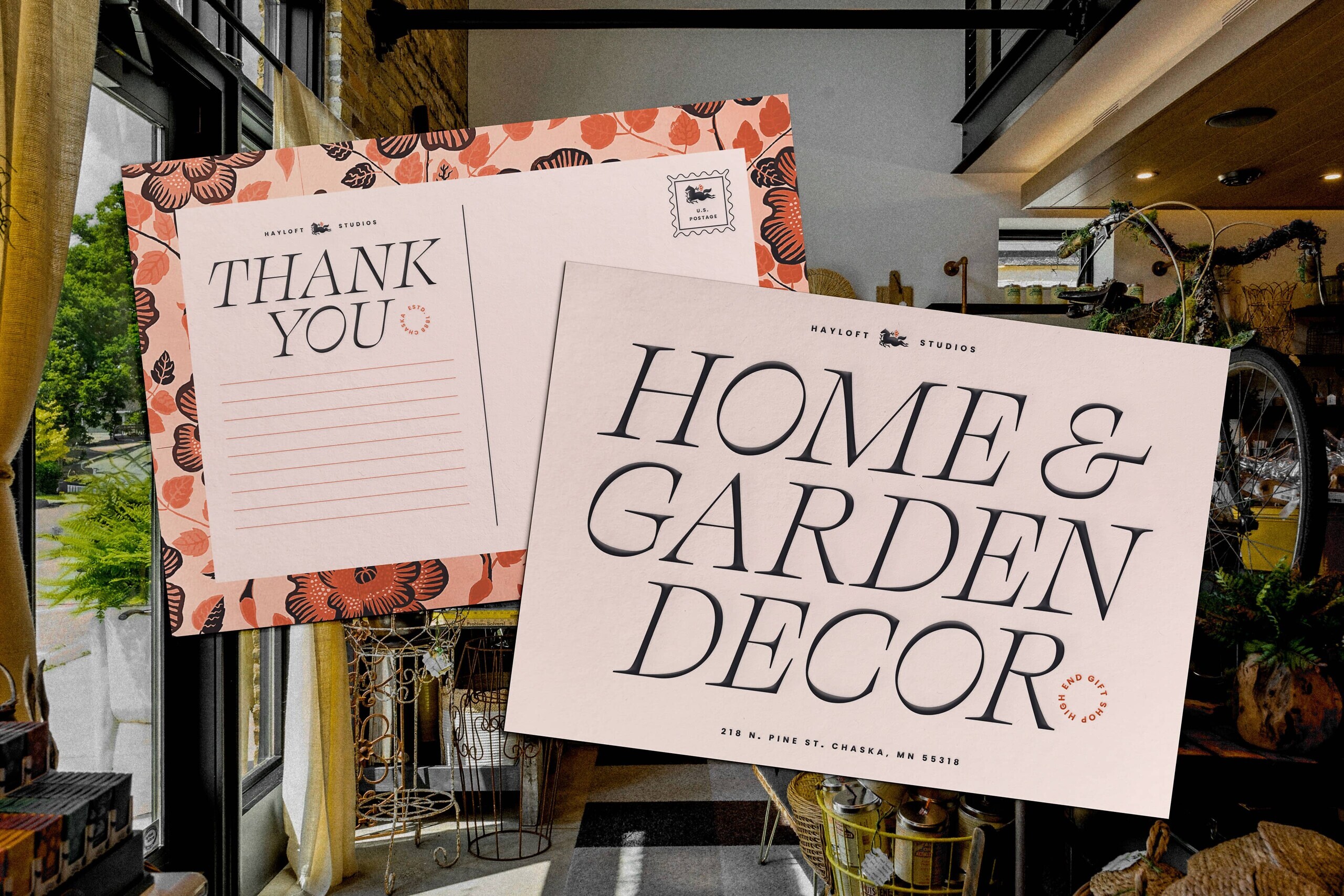
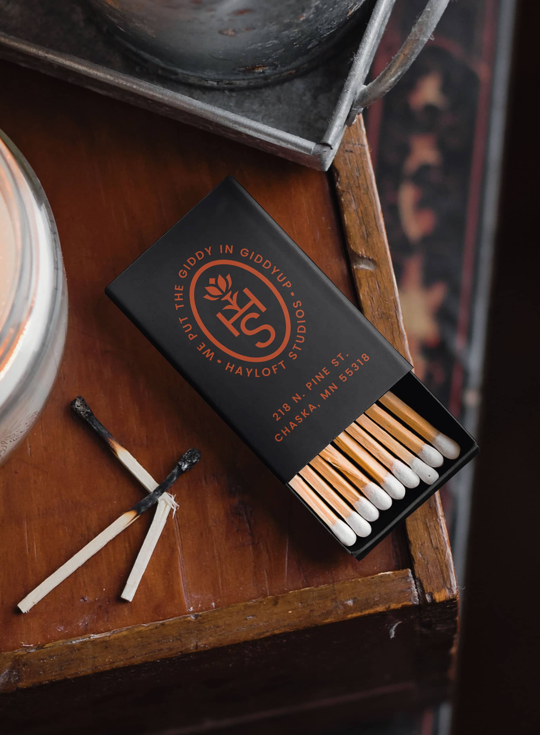
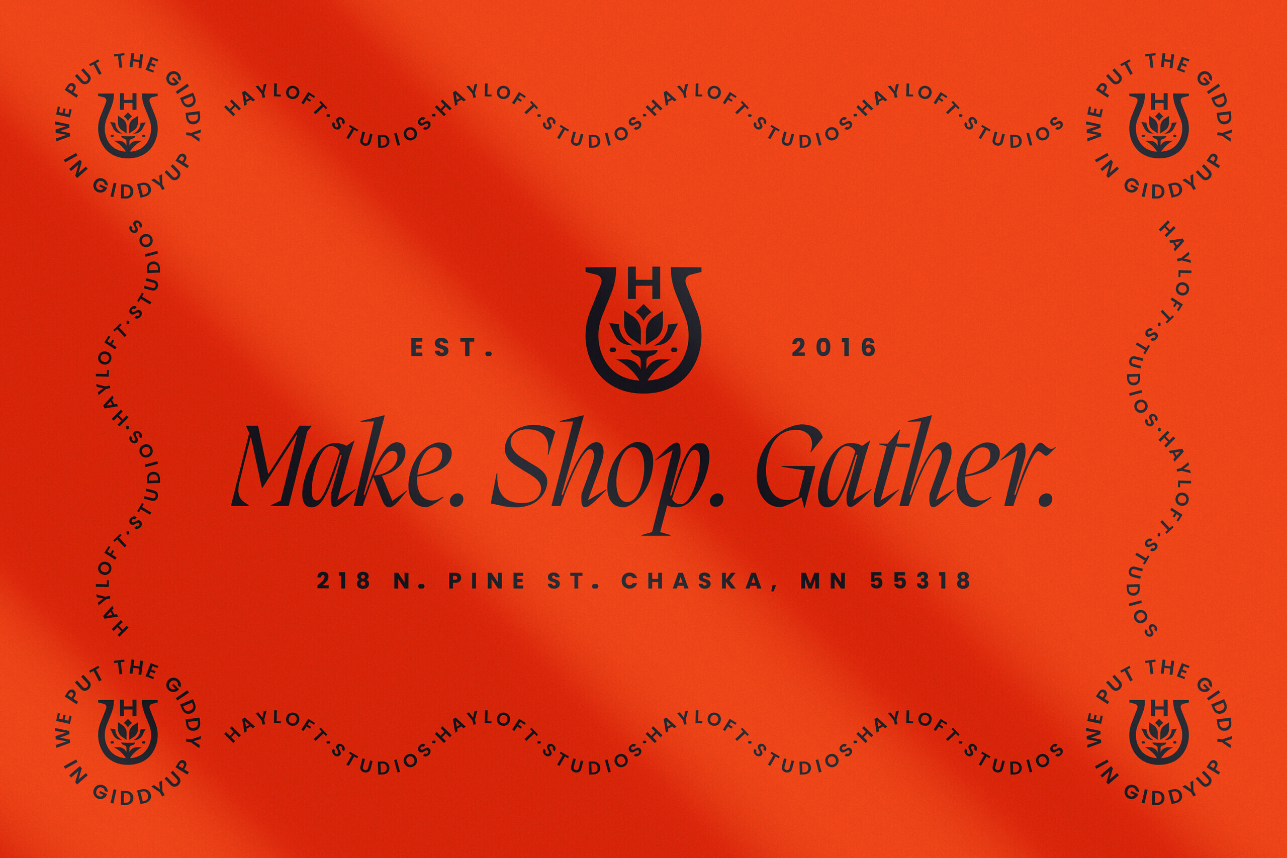
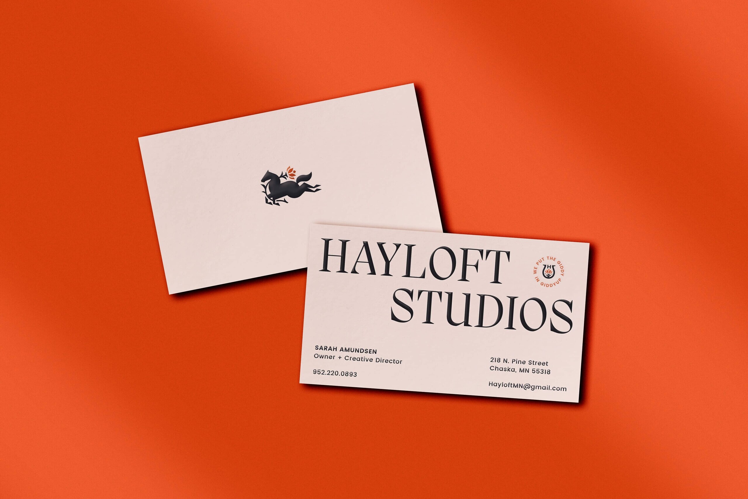
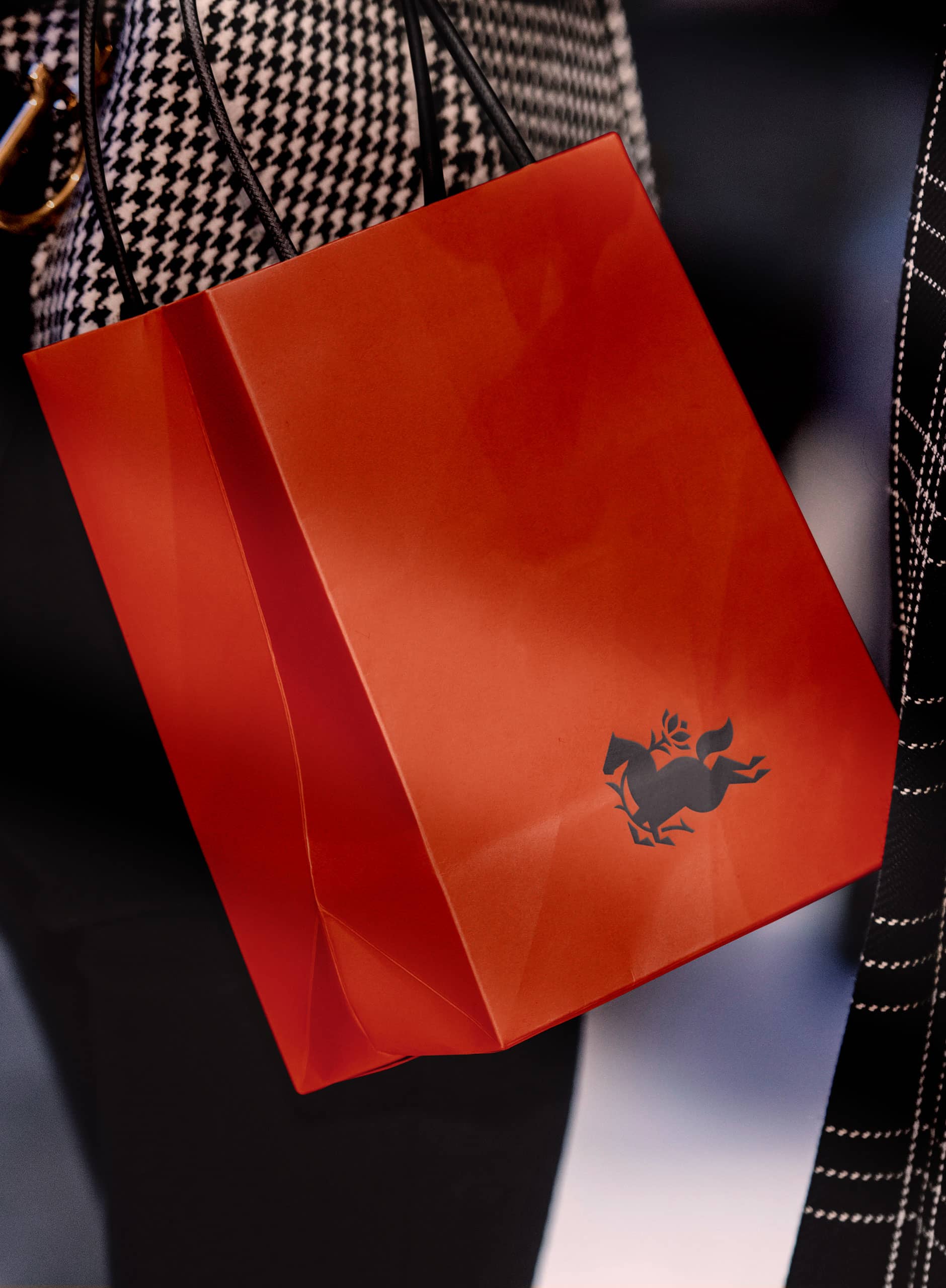
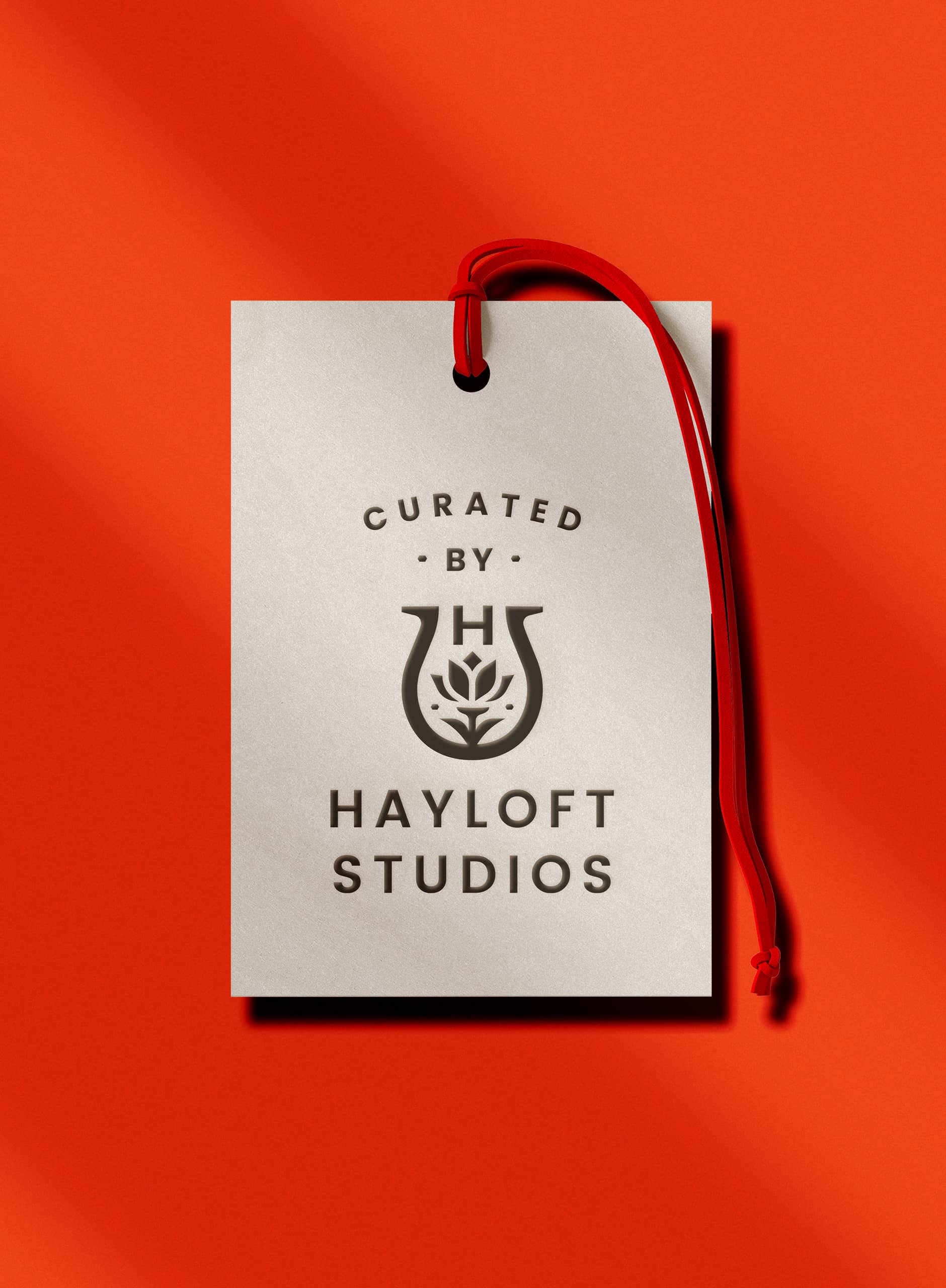
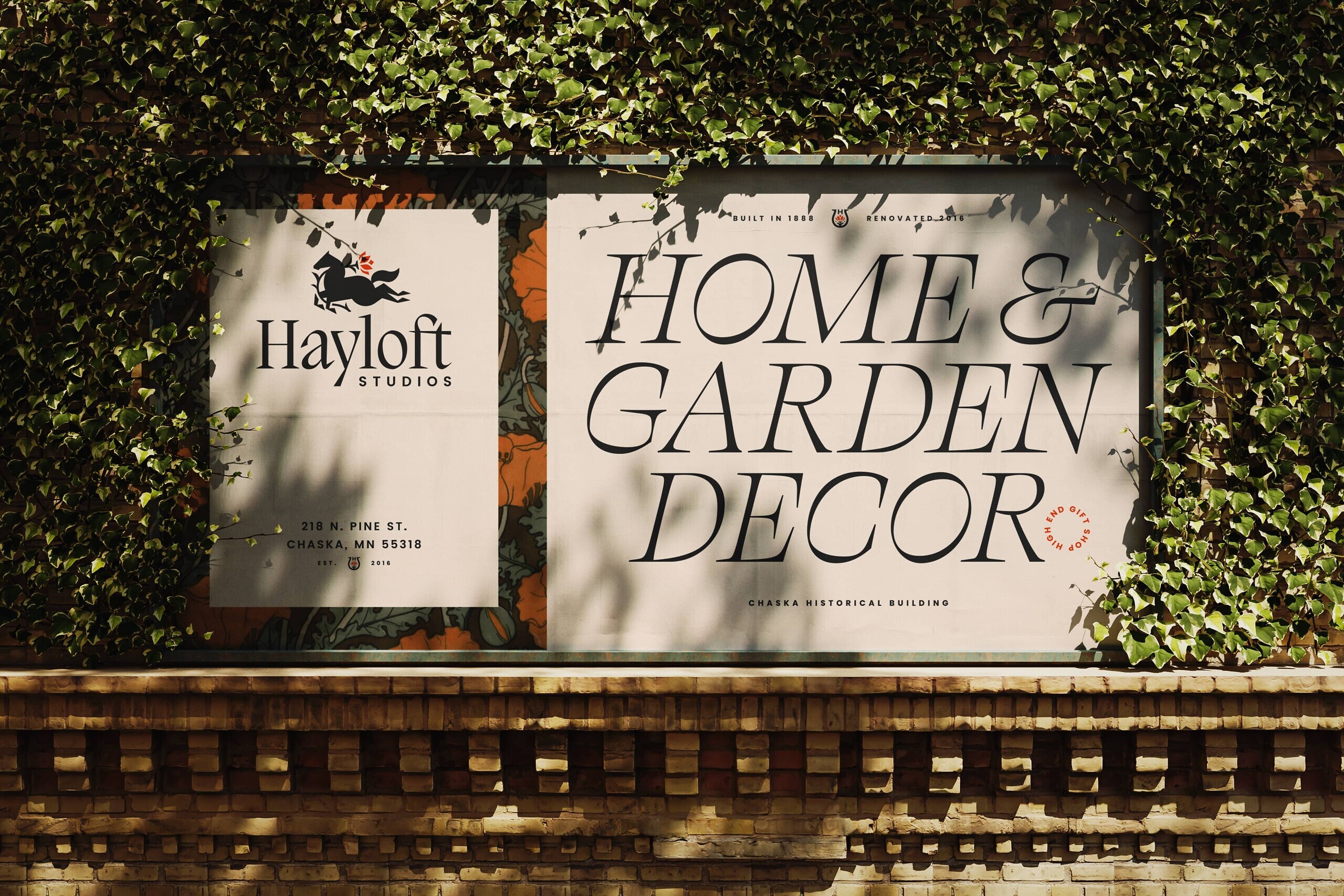
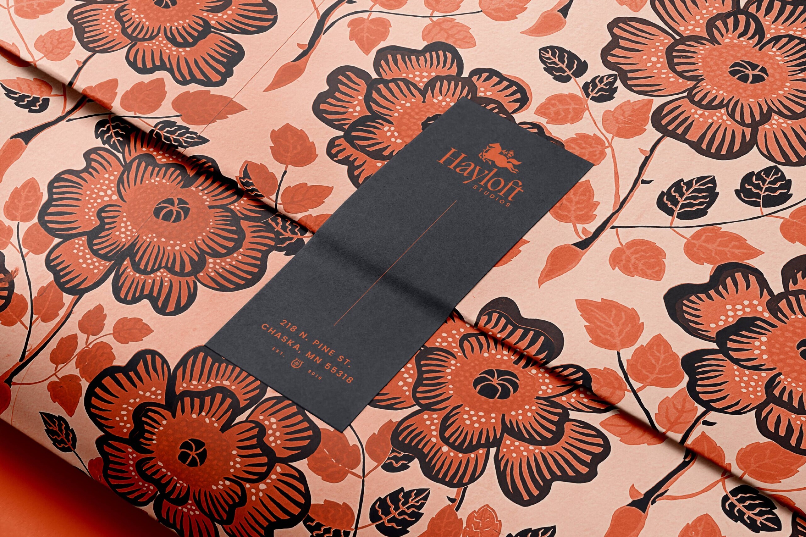
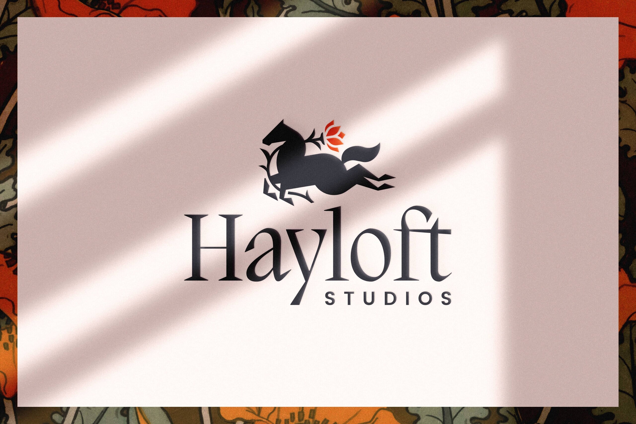
We crafted a logo that brought together both, a horse in full gallop to create a rustic throwback vibe and a floral element to rein it in and create the feel of elevated retail. Our typography also strikes a balance that feels upscale while still feeling warm, welcoming, and maybe even a little playful too. We derived our color selections from the studio itself, and wove in secondary fonts and elements like floral patterns and 19th century maps to add extra flair and personality.
All together, it feels almost a bit whimsical, and we’re excited to see how Hayloft takes off and offers people a chance to make, shop, gather, and find that sense of simple retreat amid their fast-paced lives.
Brand Identity
