Potluck Kitchenware
Services:
Brief
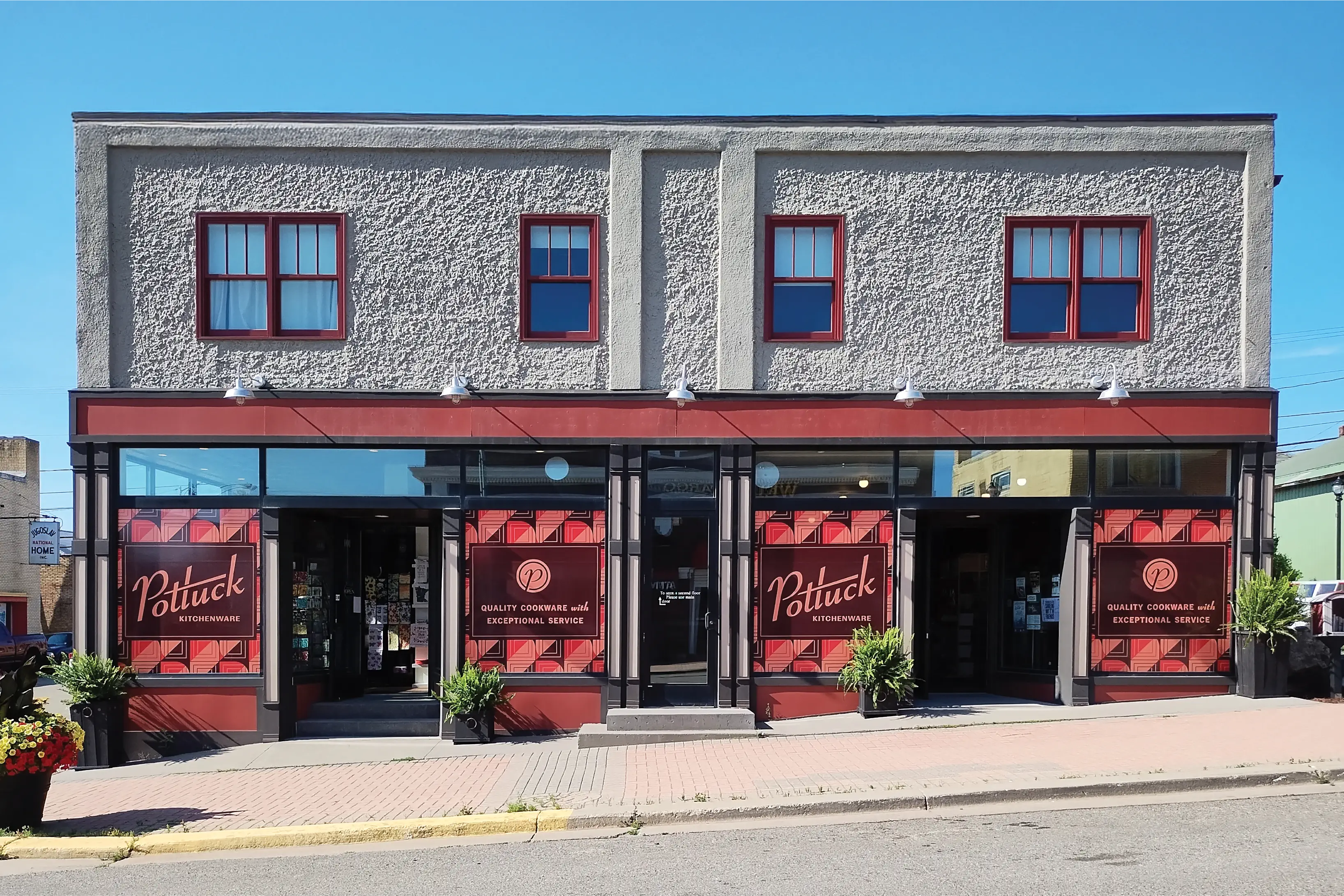
Nestled on a corner of Chapman Street in one of the Coolest Small Towns in America, Potluck Kitchenware offers more than carefully curated cookware. Since purchasing Potluck in 2023, Kelsey Lee has been on a mission to transform what was once a cluttered antique store with incidental new kitchenware into a must-visit retail destination.
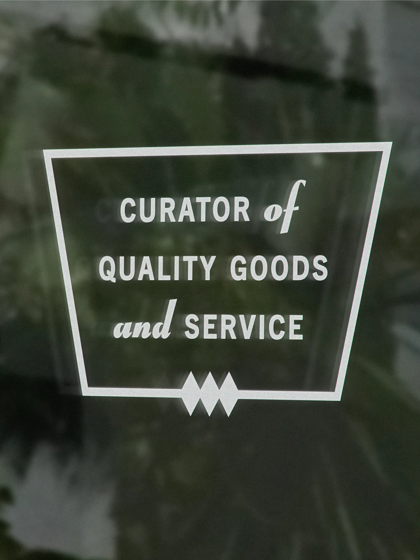
With a visual balance of retro color, exceptional mise-en-place merchandise, and an always-going background of jazz from across decades and countries, Potluck Kitchenware is meant to take you places. But while Kelsey has been thoughtfully updating the physical space and upgrading the inventory, the Potluck brand lagged behind with an aesthetic that looked retro, but not in a good way.
Our challenge was to create a custom visual identity that drove new foot traffic to a secondary business street while appealing to three audiences:
- Seasonal Residents, who are invested in Ely’s growth and eager to support local shops that are scaling up or expanding,
- Visitors, who are less interested in kitchenware than finding memorable experiences while trotting about the town,
- and Year-Round Residents, who seek high-quality products for their everyday homes but need to feel that they’re not being priced out of shopping at Potluck
Outcome
But how do you create a memorable experience that takes you back to earlier eras? It can quickly devolve into a parade of atomic starbursts, boomerang curves, and other elements that don’t evoke the kind of nostalgia and inspiration that people actually love about a retro feel.
Through conversations with Kelsey, we identified three core creative tensions that defined the challenge for Potluck’s new visual identity. It needed to be:
- Sophisticated But Warm
- Maximalist But Organized
- Classic But Not Kitschy
We presented two visual directions, one of them a full 1950s treatment and the other placing a greater emphasis on Potluck as an upscale boutique and community pillar. Jazz is a staple sound at Potluck, so when an image from the first direction reminded Kelsey of a 50s Jazz Club, we began wondering if we could bottle up that kind of sophisticated aura into the brand.
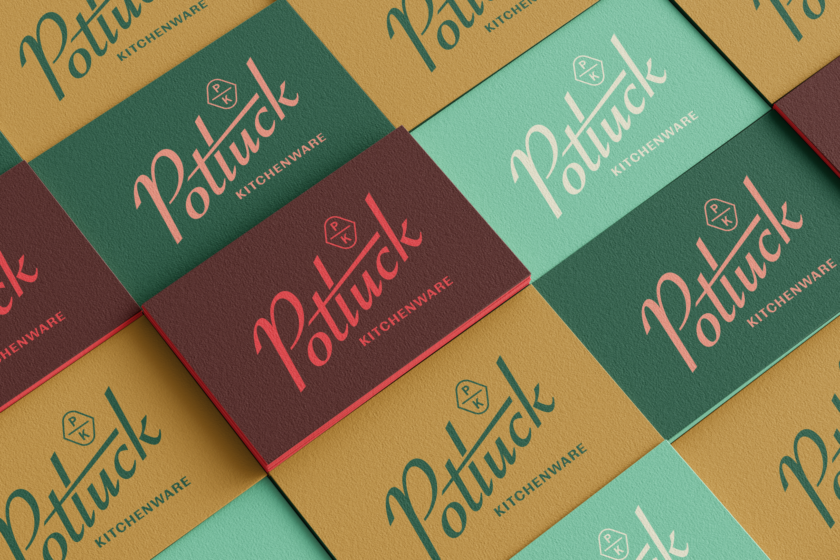
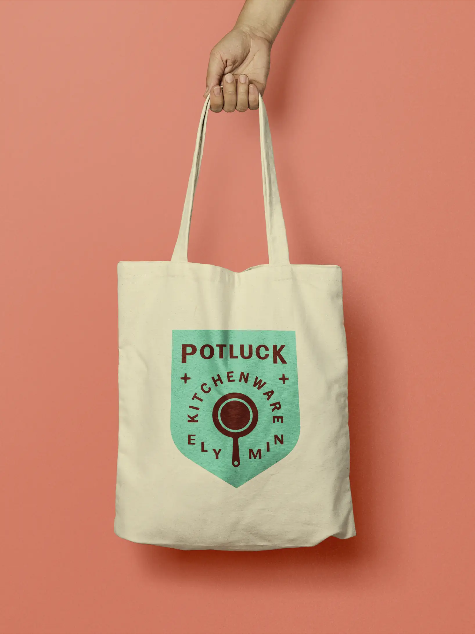
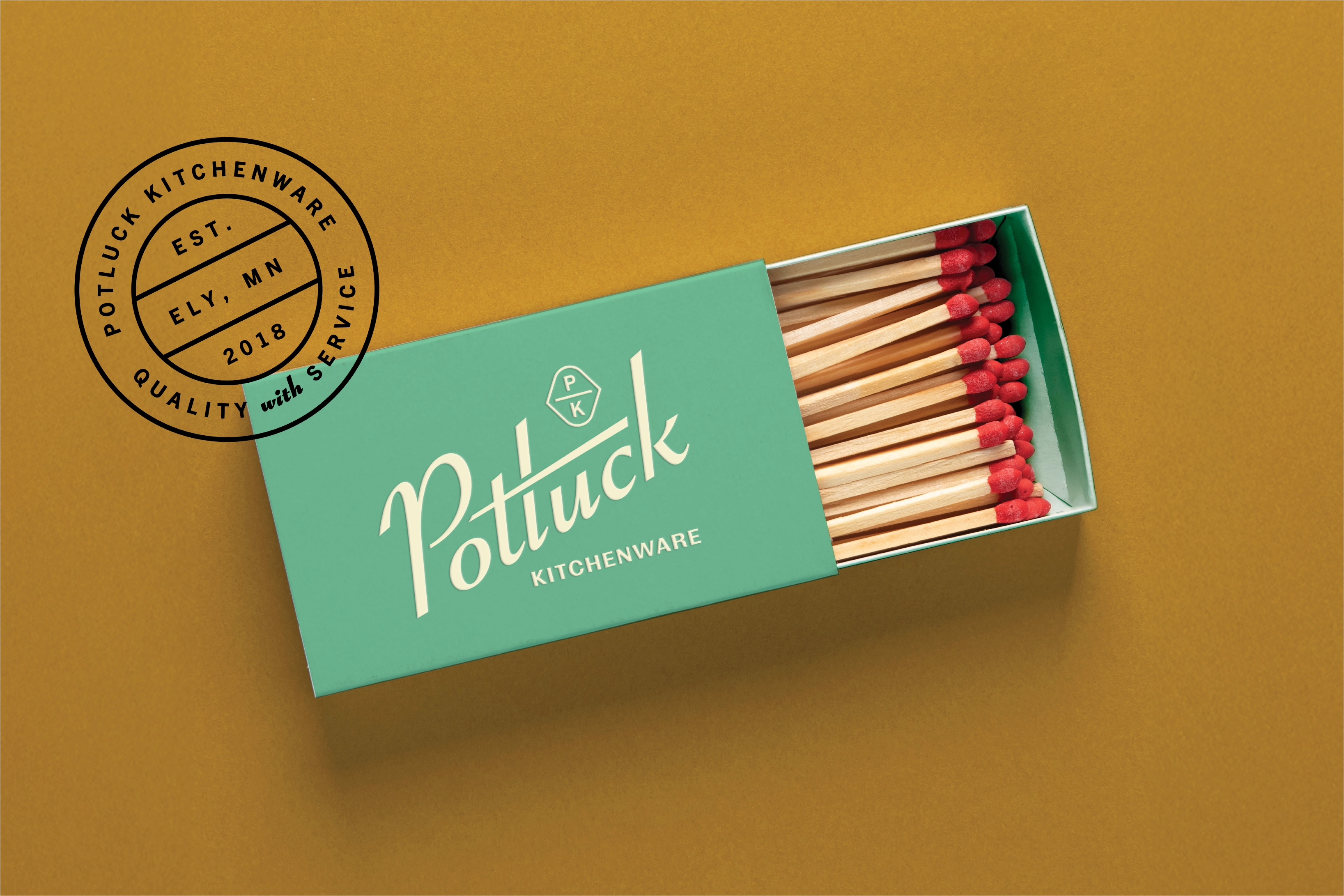
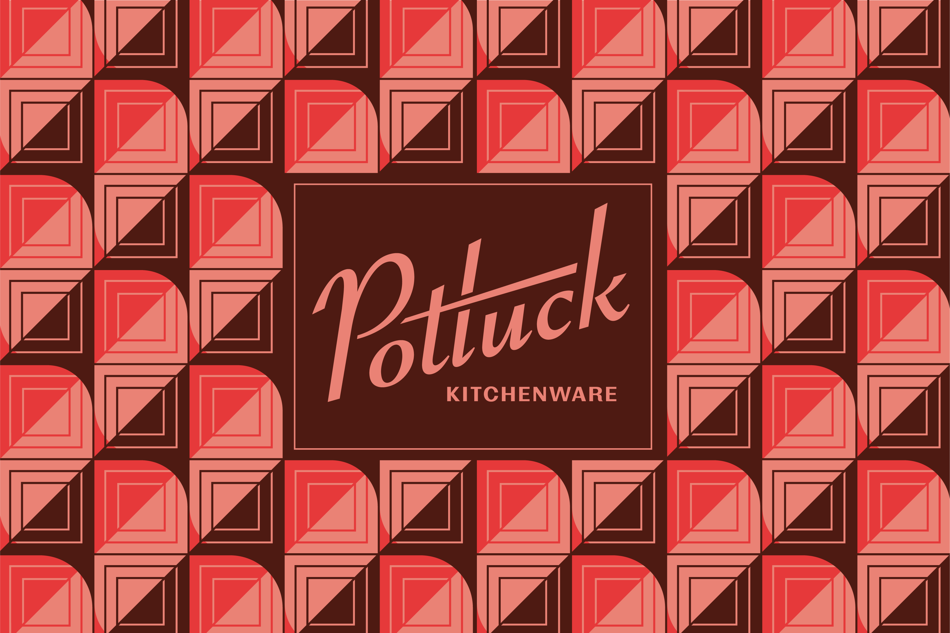
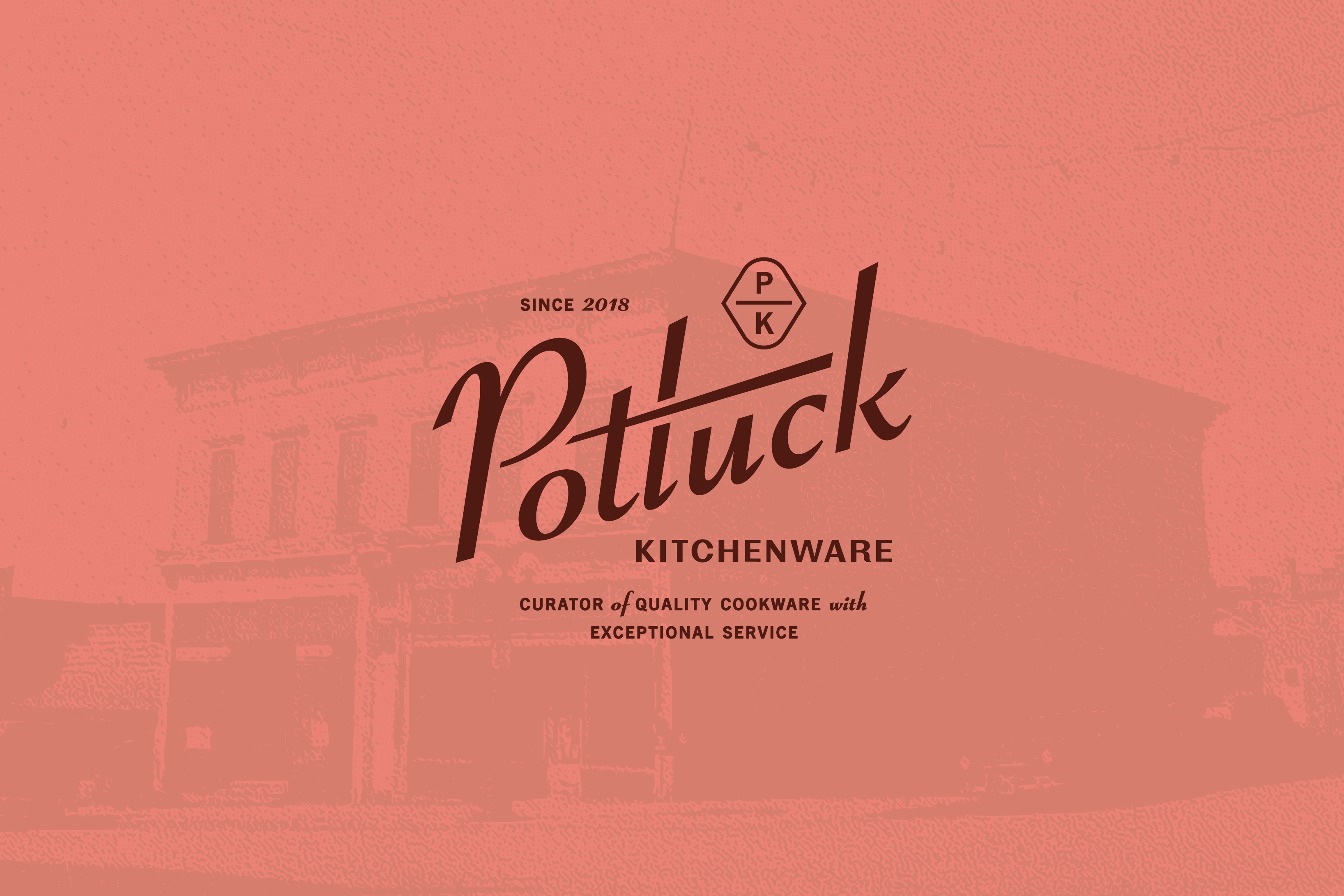
We modified an existing typeface for the wordmark to strike a balance between the exceptional quality of Potluck’s curated selection while nodding to the playful whimsy of the 50s. To balance its sophistication, we paired it with a utilitarian sans serif and warm pink and brown colors to create the feeling of a premium brand with a reach wide enough to connect with the cost-conscious.
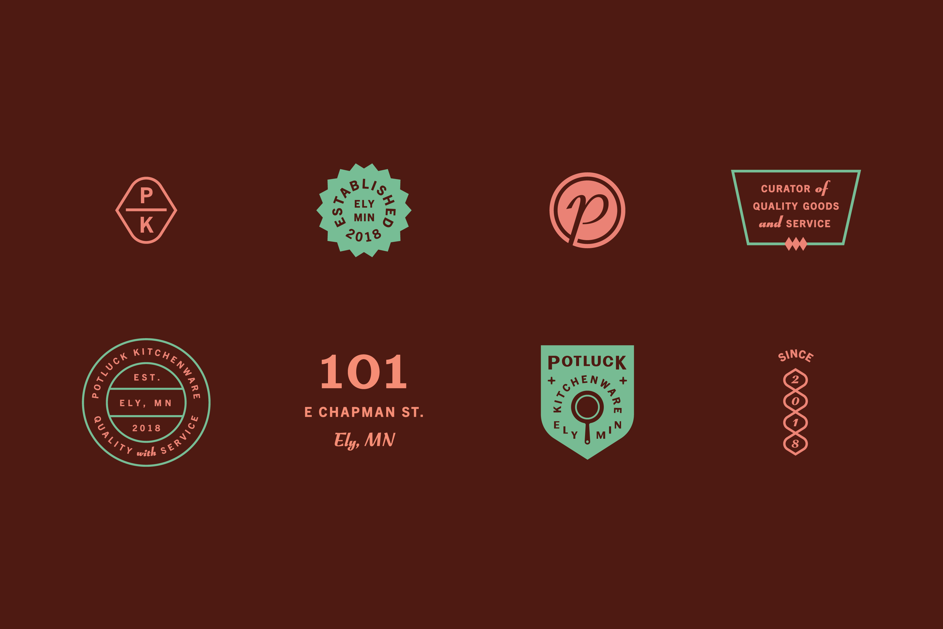
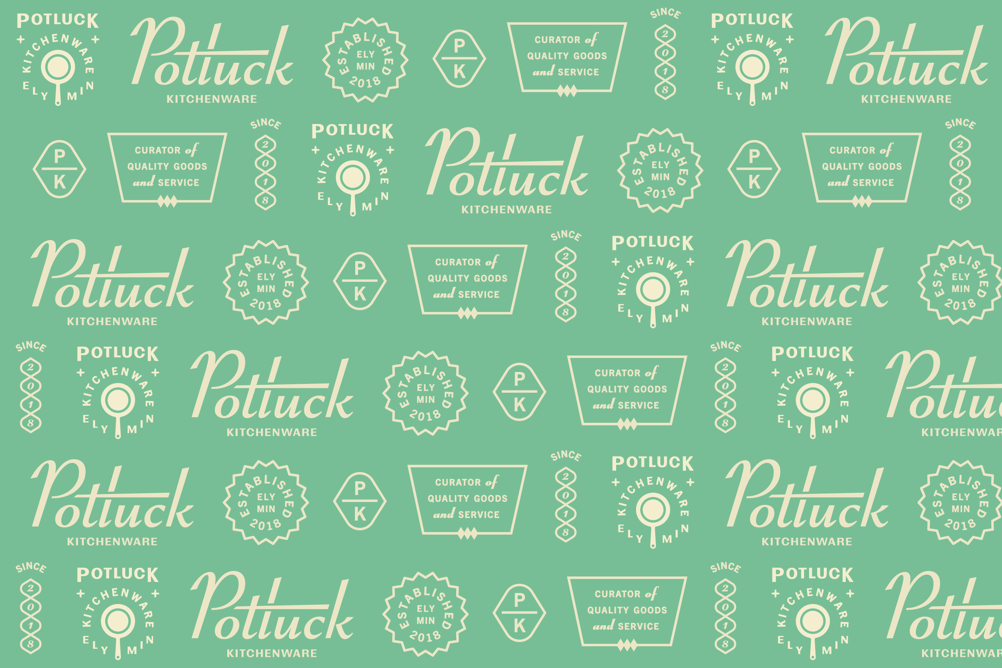
Kelsey’s store is full of items, yet her greatest feat is that it all feels organized and carefully considered. The patterns we designed for Potluck feel just as maximal at first, but when you look closer, there’s a clear variation and rhythm at play. Likewise, the secondary logos and badges fill up all the space they’re given while never feeling busy. Just like Potluck’s in-store experience, every detail in the brand works to invite you into one cohesive, retro-but-in-a-good way journey.
“Your creative brief helped me to see the brand in a new light. The way you named the store dynamics as creative tensions was such a lightbulb moment.” — Kelsey Lee, Owner of Potluck Kitchenware