Brief
The mistake is thinking it started in Tulum. That’s where it first touched Earth, but it didn’t start there. Its movement has no founder. Its only dogma, actually, is movement itself.
This one begins, as run clubs never do, in the distant cosmos. A collective consciousness that’s always been there, like a radio signal never tuned into.
As Tony and Elle Madalone stripped their life down to the essentials — quitting processed food and the rat race in favor of a fitness-focused life in Tulum — they experienced it for the first time through Run Tulum. More and more wellness seekers joined the weekly runs.
This was more than sweat and electrolyte beverages, though you’ll find both on Wednesday nights. What the Madalones found: when people move together, they enter an alternate dimension. An energy accessed through walking and running, sand and asphalt, people from far-flung corners of Earth connected through the simple act of movement.
What started as a local community of people moving together through the streets and jungle of the Yucatan Peninsula tapped into something larger than itself. A Cardio Cult, linking people across cities, continents, and lived experiences.
The challenge, for us, was to create a visual language for a global platform to link all running clubs together, where clubs across the world can plug in, access resources, get guidance on building their own communities, and become part of something larger than their city block.
Outcome
The brief was as unique as it was specific: Deus Ex Machina meets Kid Cudi’s cosmic universe through global run culture.
Tony and Elle had a fully developed mythology that is equal parts cosmic and gritty, with its own language, values, and way of seeing running as something closer to ritual than recreation. A studio’s dream, really: a clear vision from the founder, plenty of directions to pursue that would all be unique, and a lot of trust from the Madalones for us to execute it.
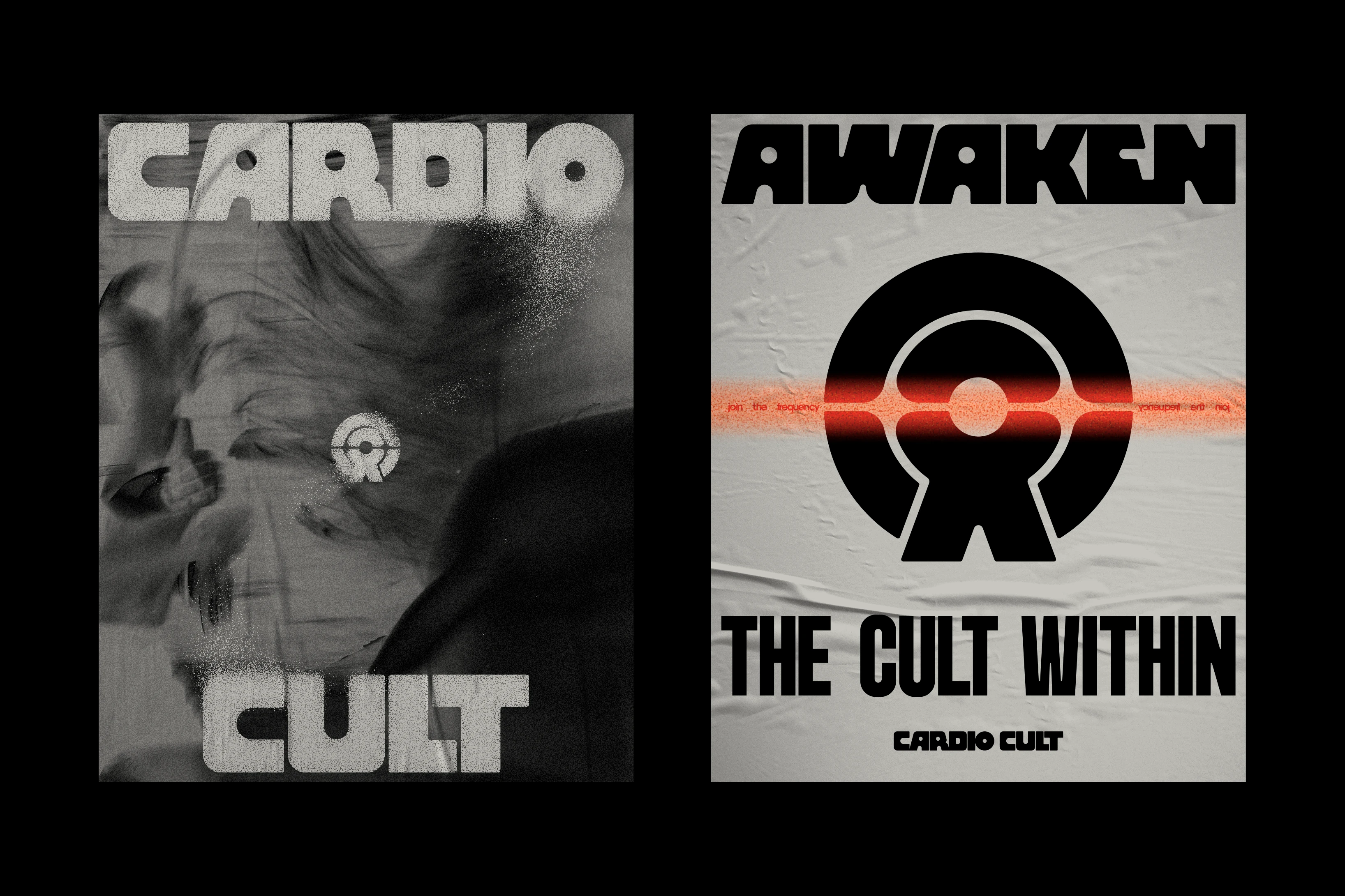
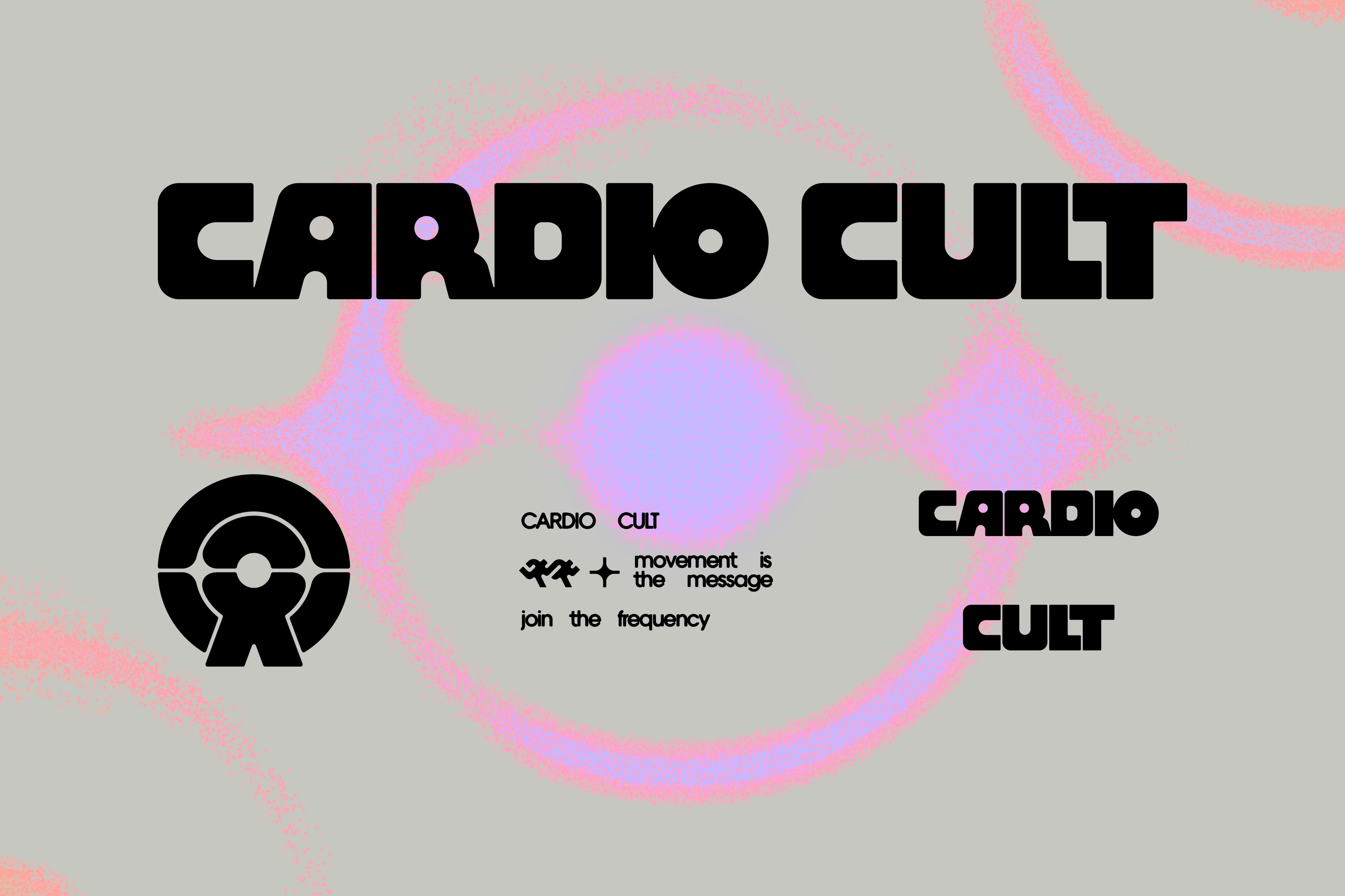
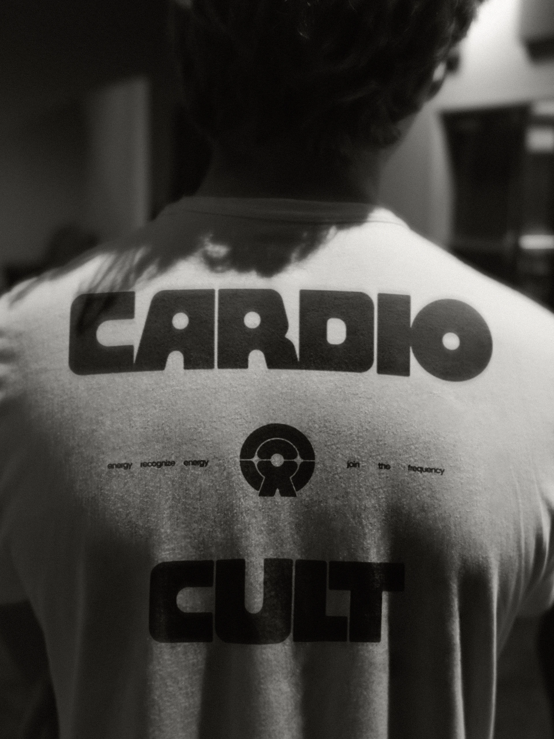
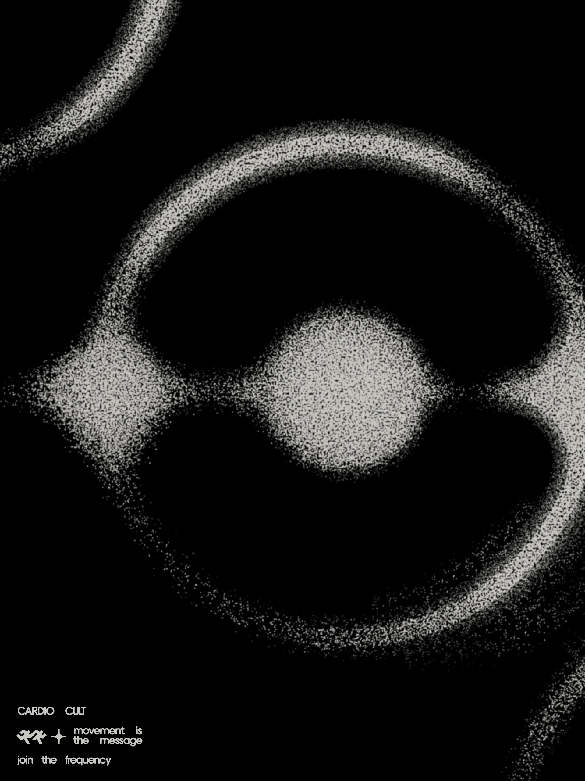
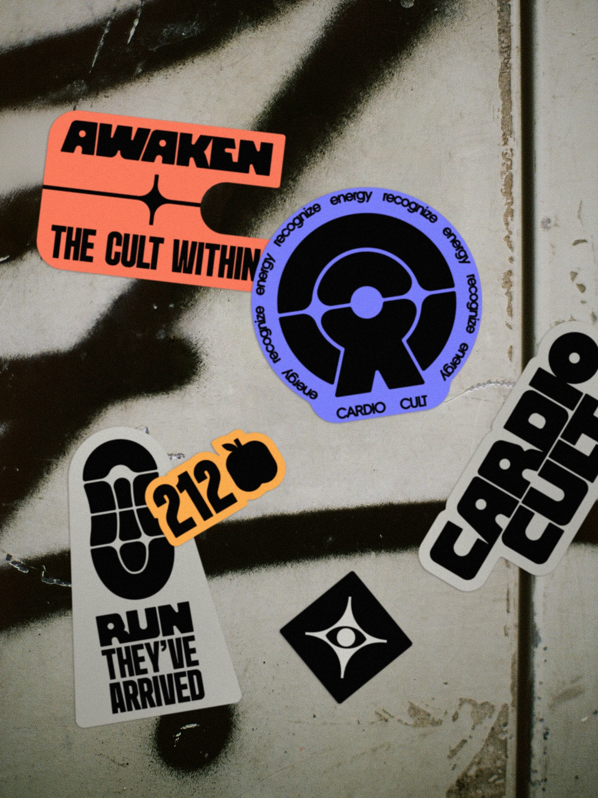
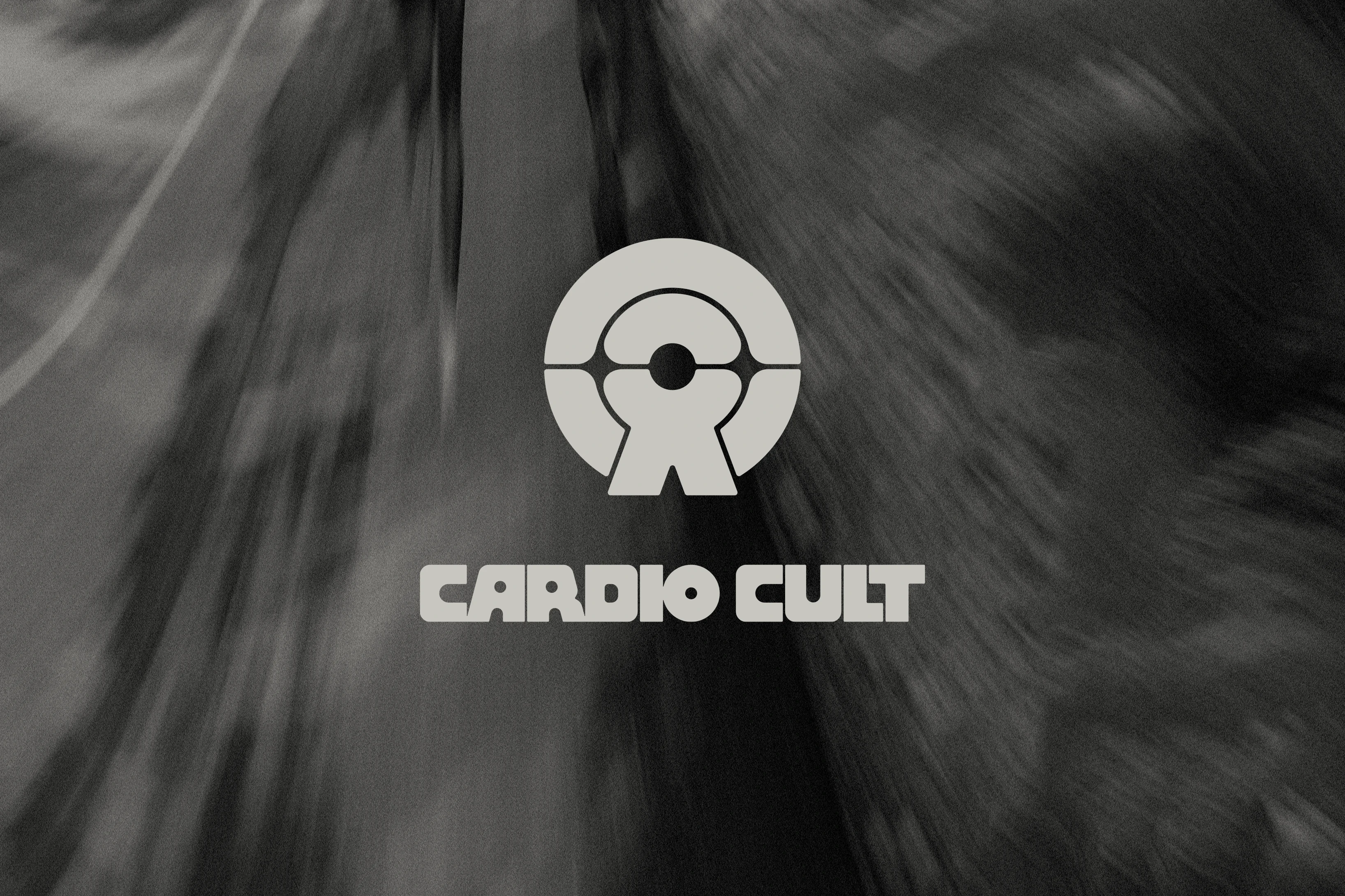
The Cardio Cult symbol does a lot of work: a circular form containing a figure in motion, bisected by a horizontal axis that reads simultaneously as a signal, a horizon line, and a point of transmission. It’s abstract enough to feel like mythology, but gritty enough to play well on a jersey.
The wordmark was built as a companion to the icon, with heavy and rounded custom type with subtle counterspaces that feel drilled rather than drawn.
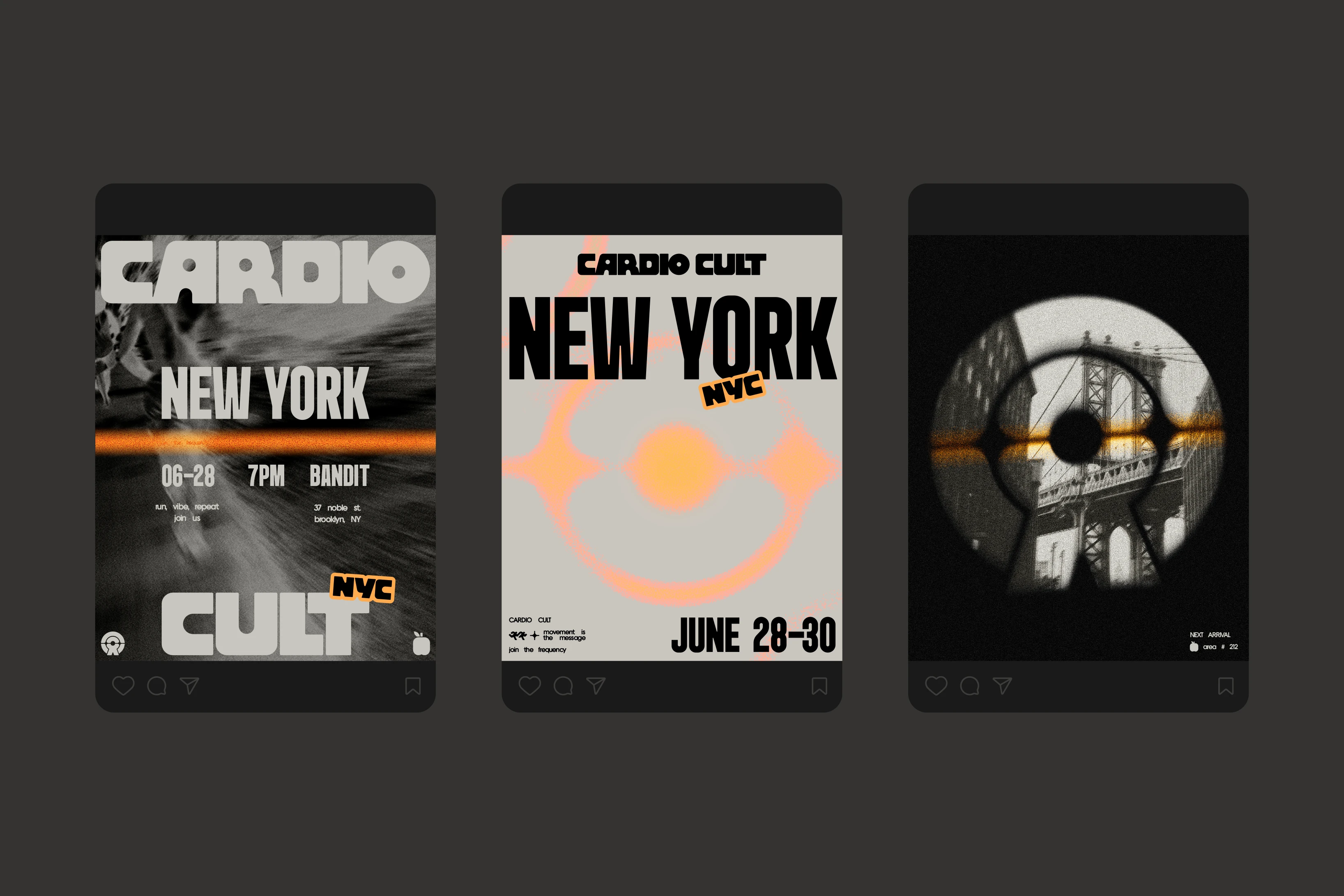
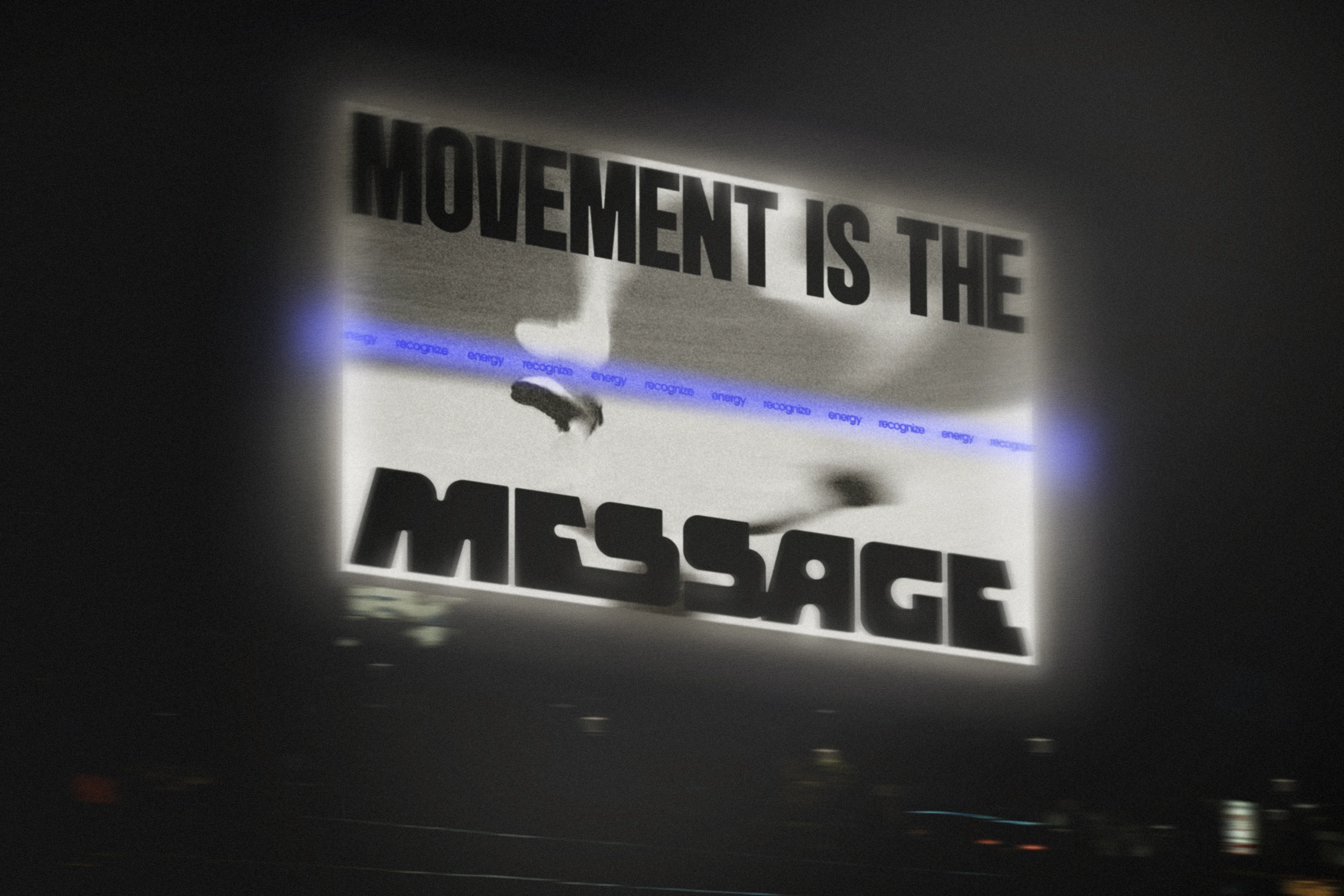
Color was a deliberate swing away from the monochromatic world most run brands live in. Gray and black meet the expectations, then secondary colors like electric blue and coral red subvert them. When the Cult gets a city-wide following, these will be ready to deploy as chapter colors.
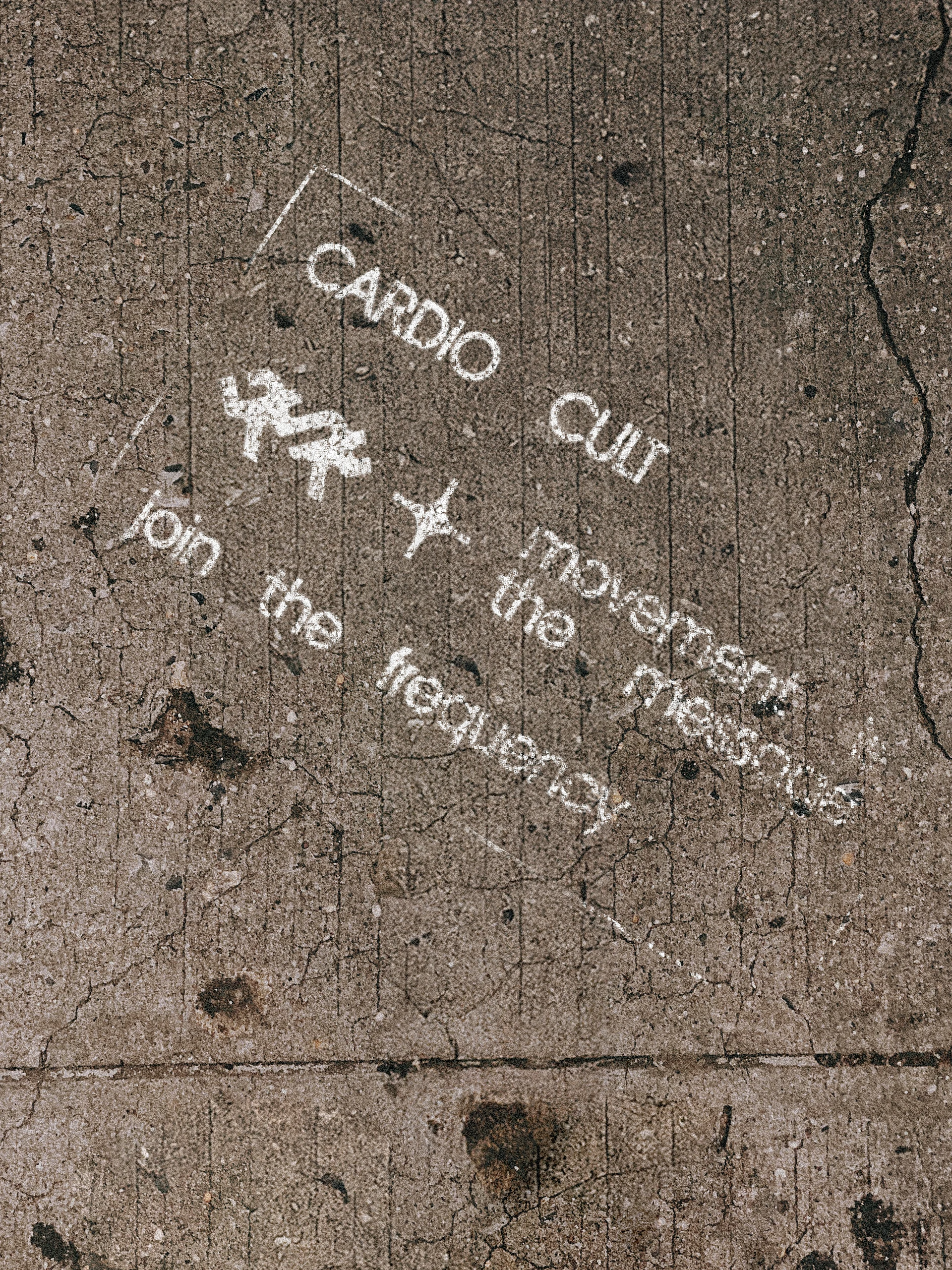
Location-tagged graphics extend that logic into something tactile: 212 for New York, 305 for Miami, and so on. Individual chapters own something distinct while the identity remains coherent. The visual system, like Cardio Cult itself, is meant to move.
“This is the third major project we’ve worked on with Malley and the experience gets better every time. They truly brought our vision to life and we’re excited to keep growing (and do more work with them).” — Tony Madalone, Co-Founder, Cardio Cult