Brief
Could cannabis be the antidote to isolated modern life?
To the makers of Lost Loon, the answer is a definite Maybe. From our first conversations with Bradley and Jessica Avarden, cannabis was always about more than recreation.
To the Avardens — board game makers, goldsmiths, and perpetual tinkerers — cannabis is a connector. When done consciously, it’s an empathy-enhancer that calls us back to nature and to our loved ones.
Enter the Lost Loon.
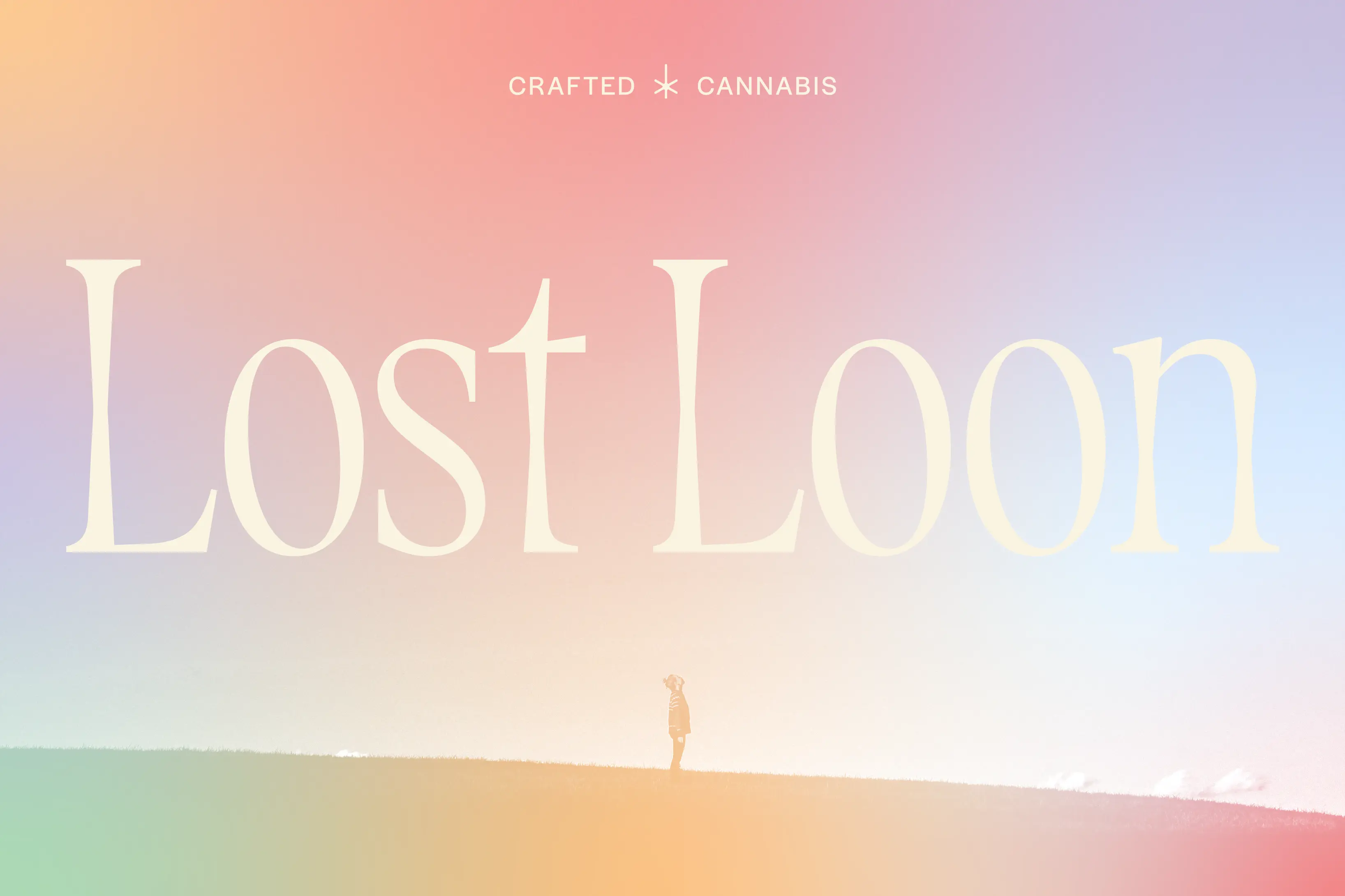
“When a loon calls out at night, it is searching for others,” Brad wrote, “Lost Loon is a call to community.”
Moving stuff. But when you’re a Minnesota company, one does not simply make a loon logo without running into headwinds. They’re everywhere and in every style and, as a result, quite tricky to pull off while feeling distinct and commanding the attention of Minnesota consumers wandering dispensary aisles.
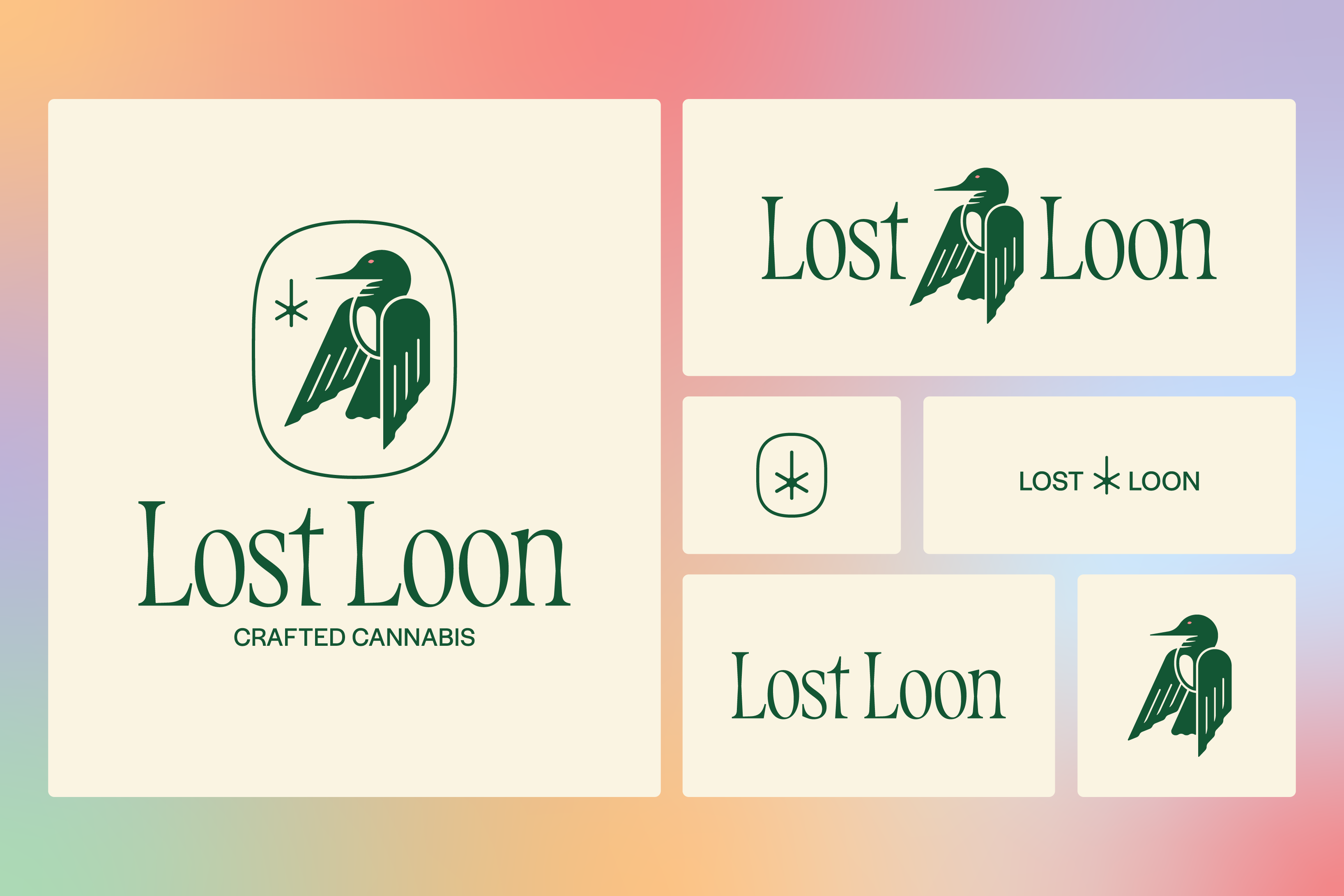
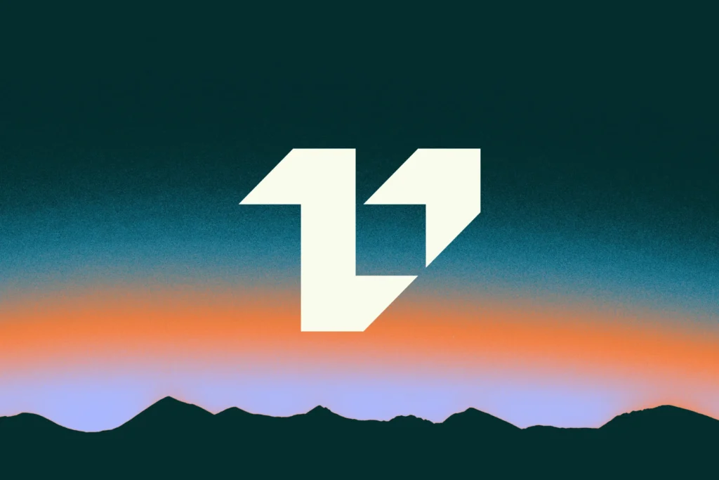
When Lost Loon called out to us, the ask had a clear frame: create a visual identity that felt premium, carefully crafted, and environmentally conscious, all organized around a loon that doesn’t look like anybody else’s.
Outcome
How do you get there?
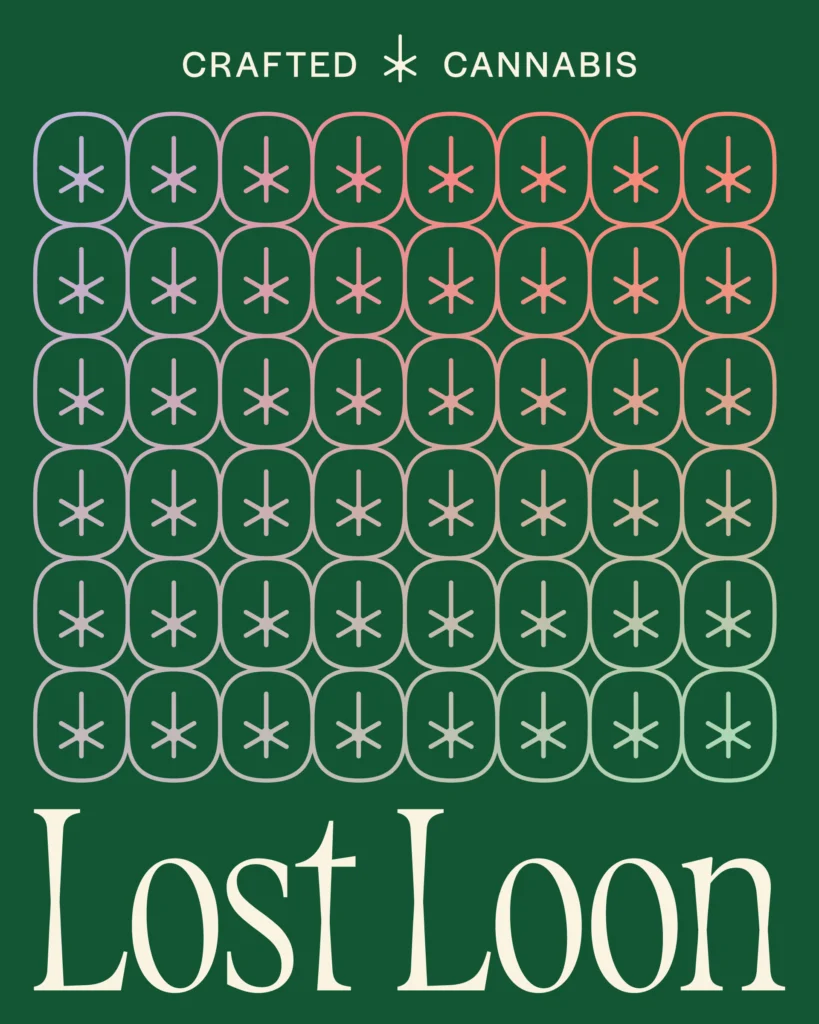
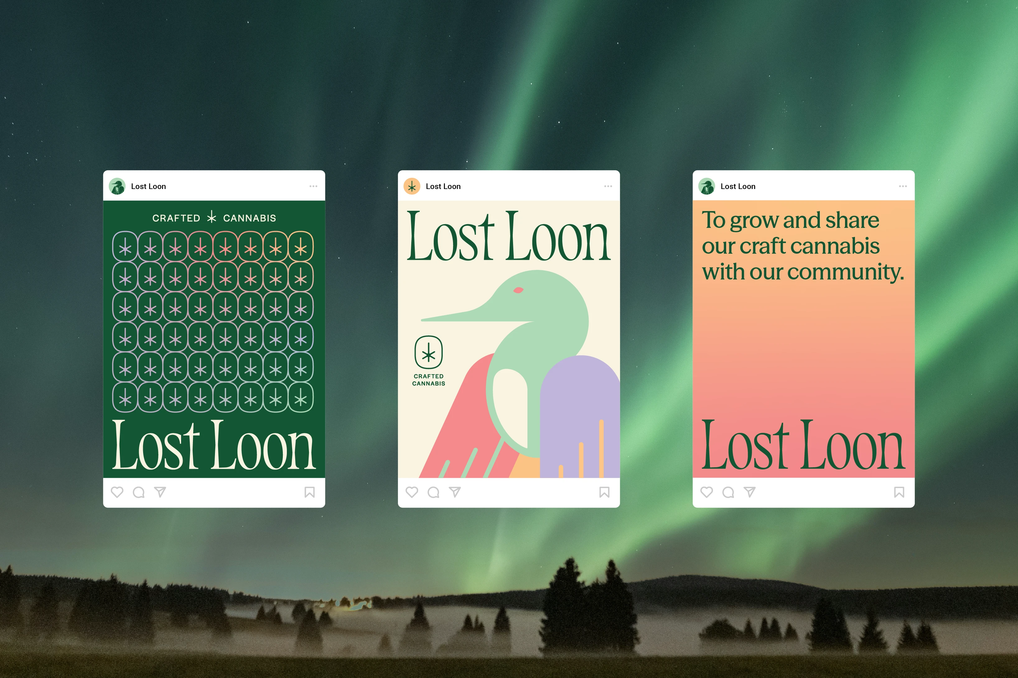
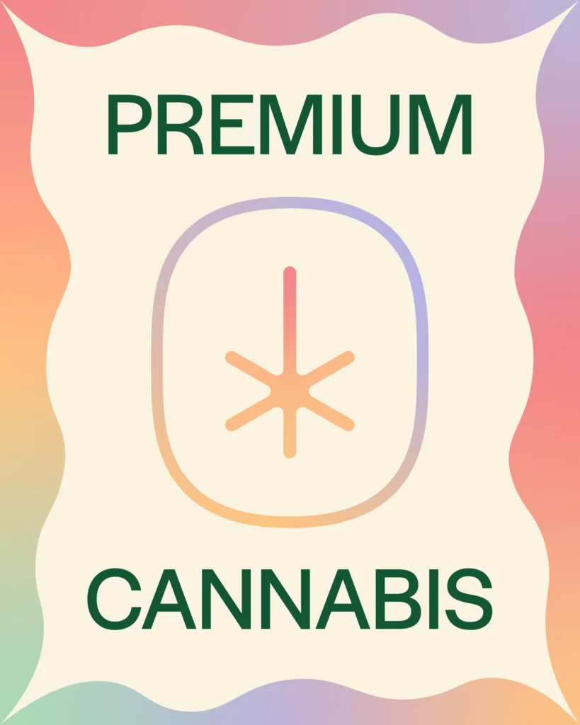
We named our aim this way: whimsical yet streamlined. Something free and playful, evocative of the groovy feeling of the 1970s, while also feeling spacious, controlled, and like high craftsmanship.
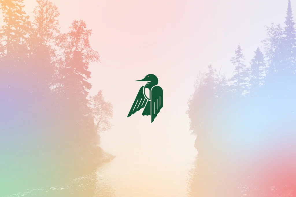
A realistic loon was never in play. One too many lake association logos, not to mention several Minnesota cannabis brands featuring a loon already. The more realistic, the less original it would be.
The mark presents the bird with body low, wings slightly raised, and looking decidedly different than loons you’re used to seeing. The pose says confidence and craft to its conscious consumer audience, and the angular wings play their part in giving the body a cohesive and visually striking feel.
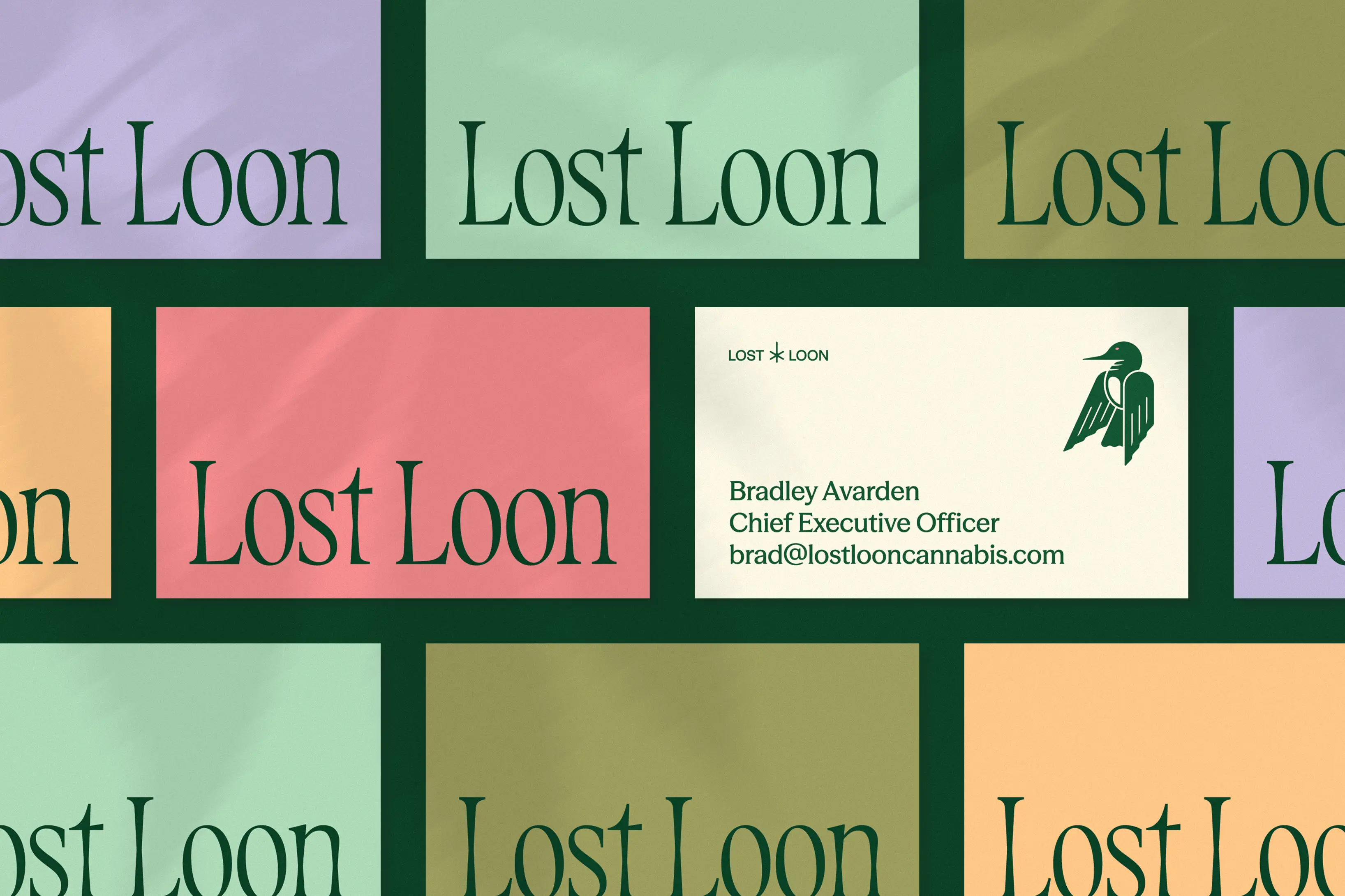
It’s rebuilt in a color palette that takes loose inspiration from nature, but with hues and saturation tweaks that feel both groovy and premium. And while the loon we made is intentionally not a dead ringer for the one you see on the lakes, the red eye in the middle keeps just enough of the signature look to be recognizable.
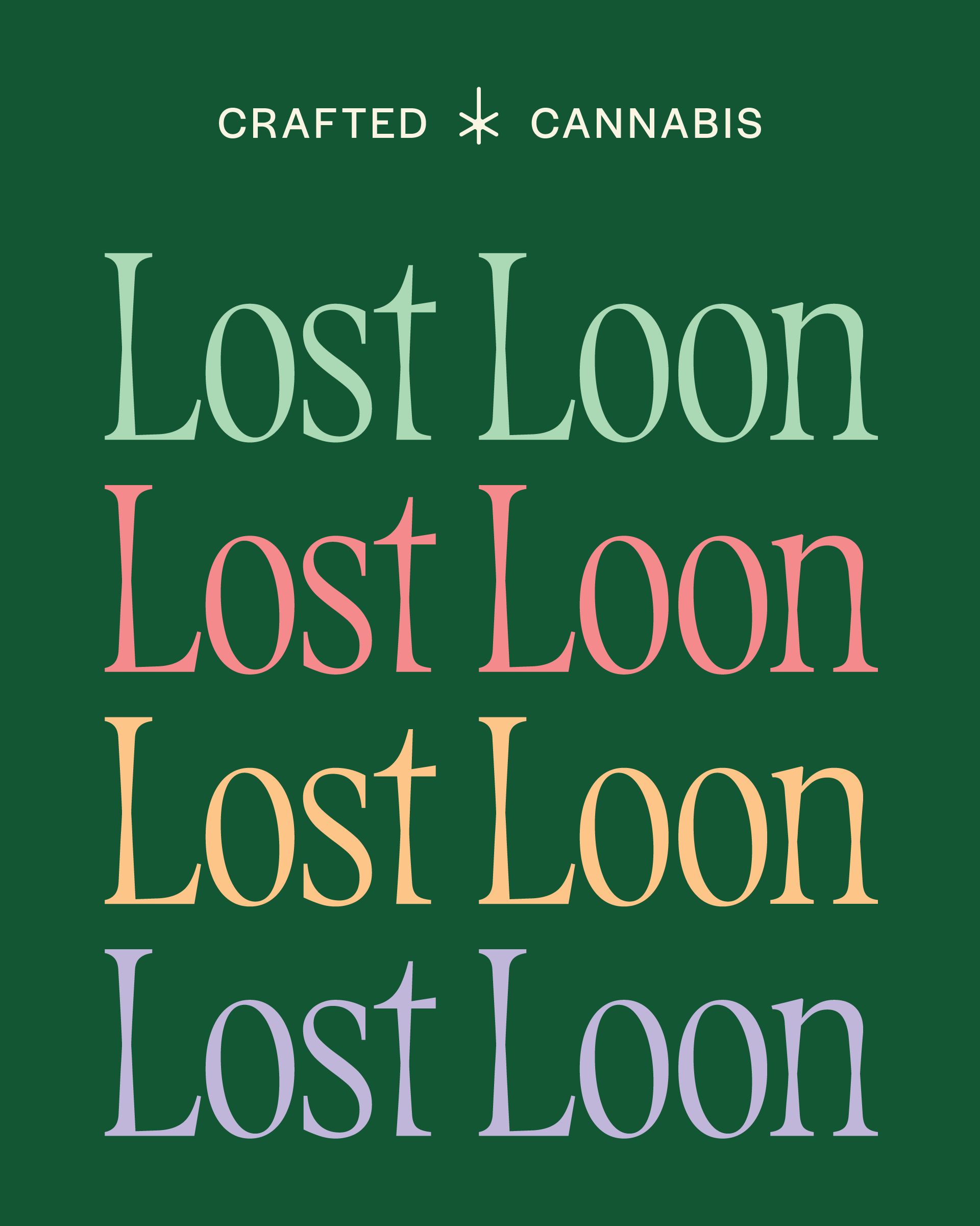
The broader identity system straddles the same whimsical-yet-streamlined tension. The Avardens were drawn to circular shapes that felt botanical, so we lent the design some curves to give it an organic feel. Typography pairs Season Mix — an elevated yet organic serif — with the Halyard family for body and subheads, giving the system range without losing cohesion.
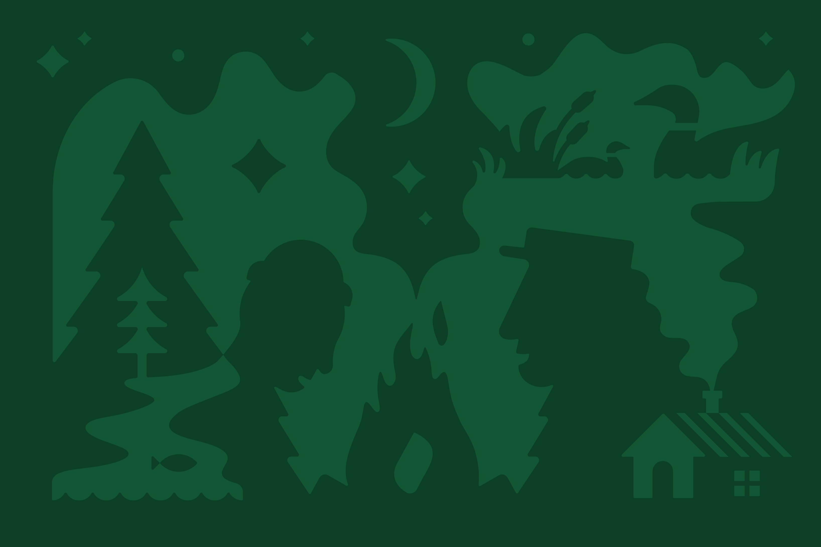
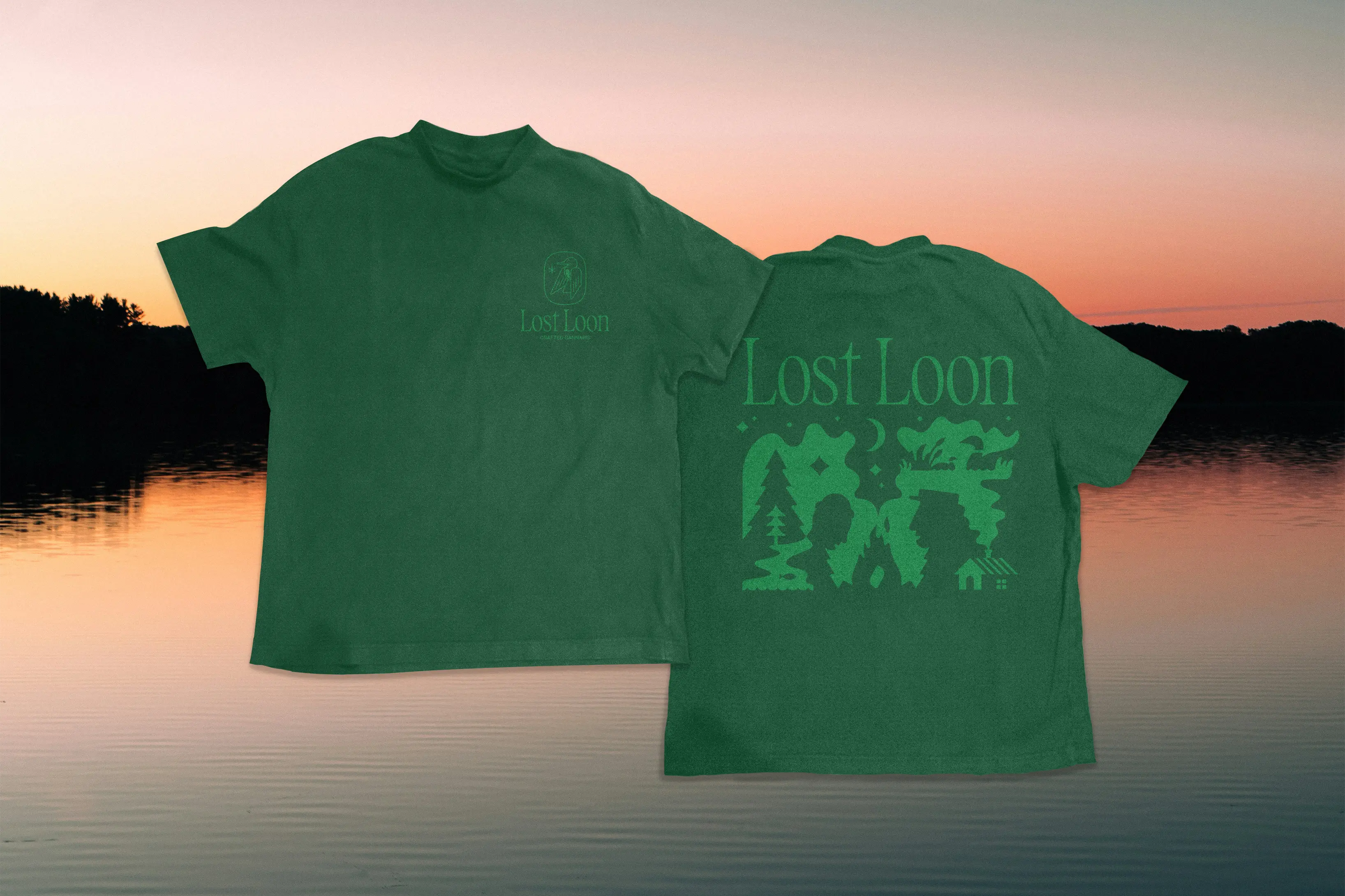
That cohesion happens to be the whole point of Lost Loon. Pulling isolated parts and bringing them back together through thoughtfully crafted cannabis. People to nature. Nature to people. And, as the fire crackles and dusk fades on an evening by the lake, maybe even bringing people back to people again.