St. Philip the Deacon
Services:
Brief
St. Philip the Deacon is what we call a church of and.
Weekend services include traditional forms—ask them about their 3,000 pipe organ sometime—and contemporary and contemplative ones as well. A big tent church where liberal and conservative worship together; a 4,000 member congregation, and a liturgy that grounds the community in centuries-long traditions. Even their hallmark lecture series, with speakers like Brené Brown, Kevin O’ Connell, and David Brooks, bears an unsurprising name: Faith and Life.
So when our longtime friends came to us ahead of their 70th anniversary and overdue for a refresh, it wasn’t surprising that the conversation was more both/and than either/or. In fact, after our first conversations about it, we agreed together on a creative brief that aimed at the following goals:
- Refreshed and recognizable: Meaningfully updating the brand that hadn’t been touched in decades, yet built on the foundation of the old one.
- Simple and sophisticated: Clean, minimalist, and stately; exercising restraint that leaves margin, while communicating the elegance and grandeur of historic churches at their best.
- Warm and modern: Tastefully dialed into their educated and professional demographic without losing a sense of soul and genuine care. Conveying excellence and high standards.
Outcome
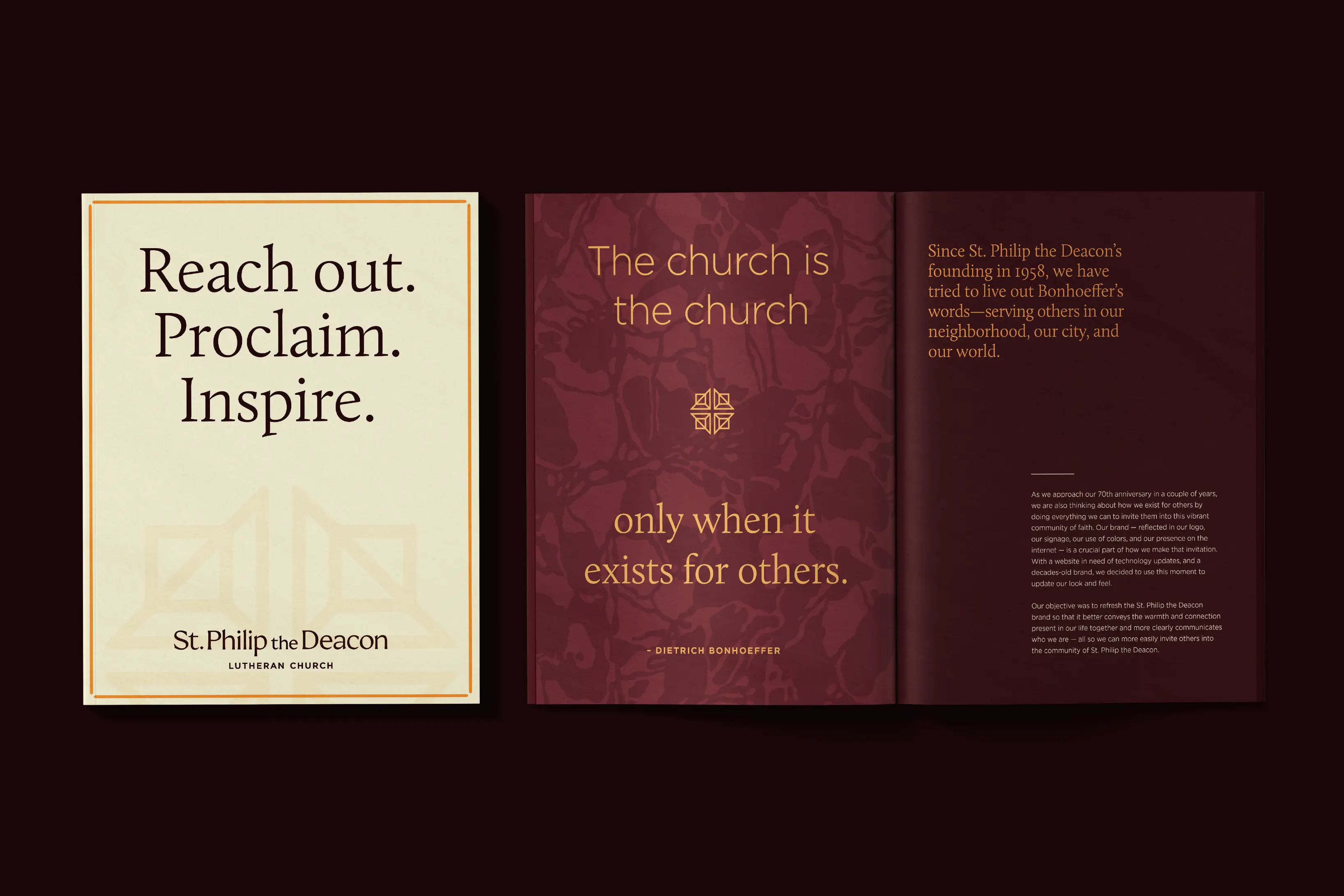
All well and good. But the best insight we found was tucked inside a conversation about Inspire, their quarterly magazine that we’ve worked on for years. Those magazines have, as they would tell it, a simple, spacious, restful feel that you want to sit with for a while. That about settled it for us. In an age of hurry and burnout and disconnection, we wanted to showcase our friends as a faith community to make time for and linger with.
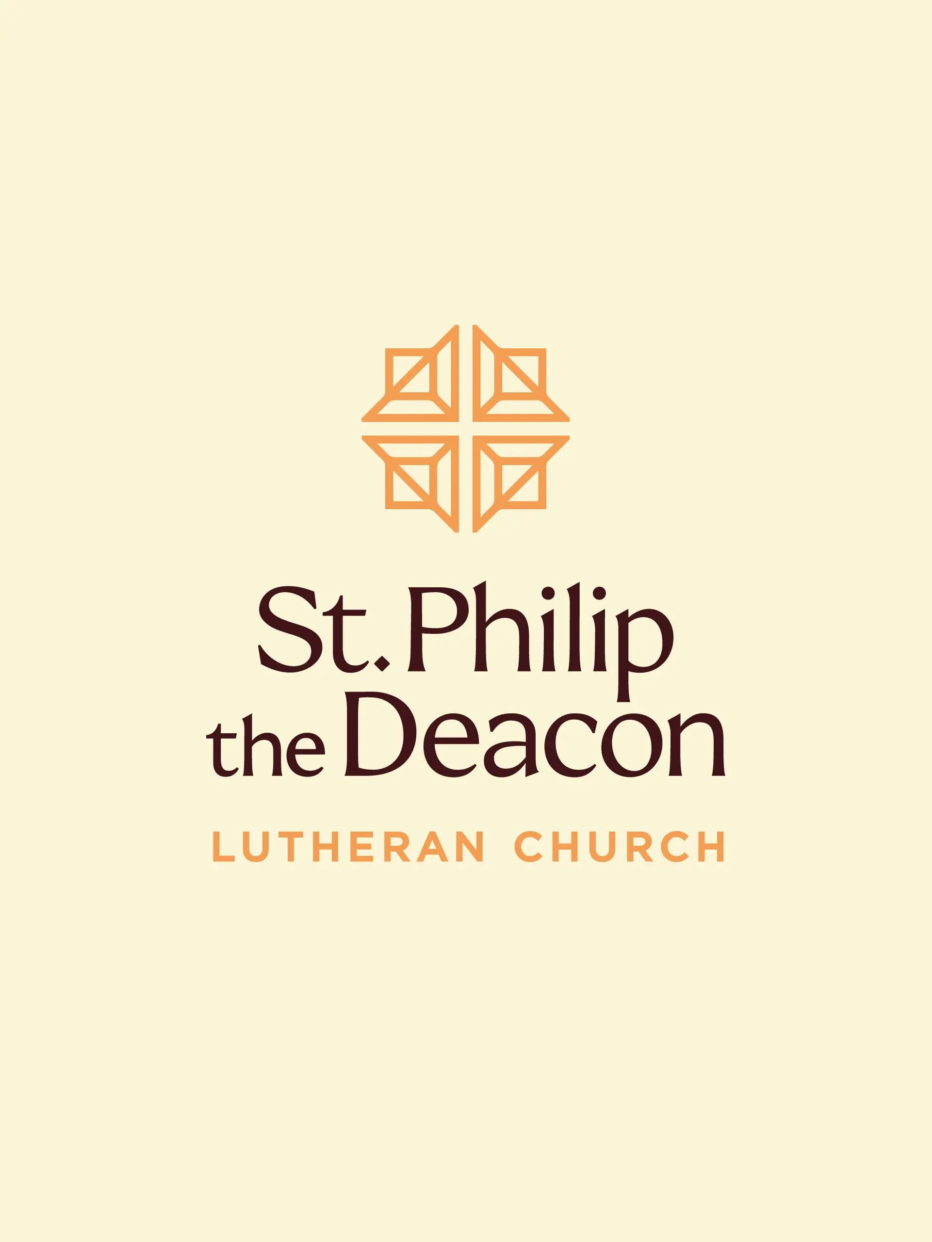
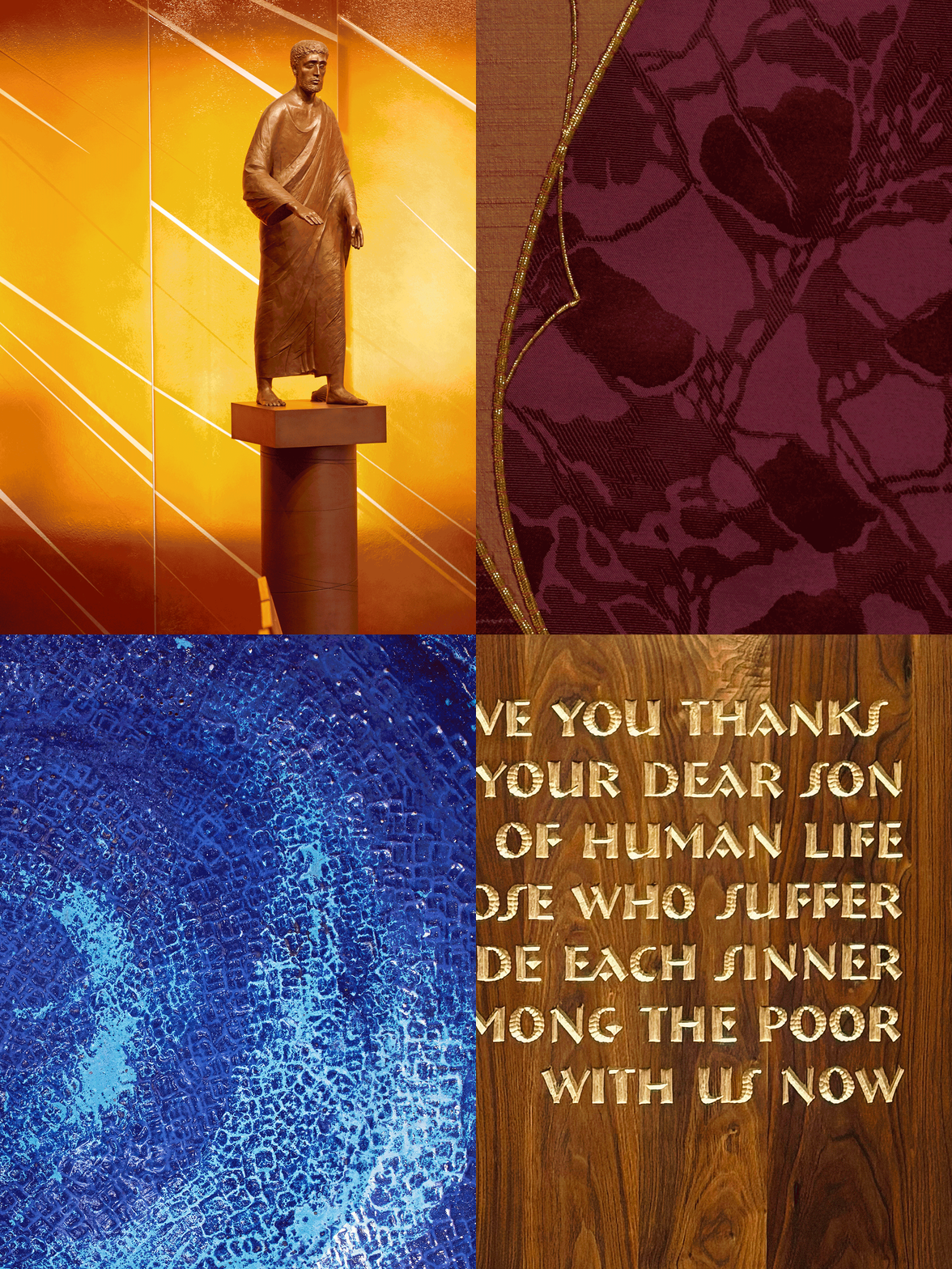
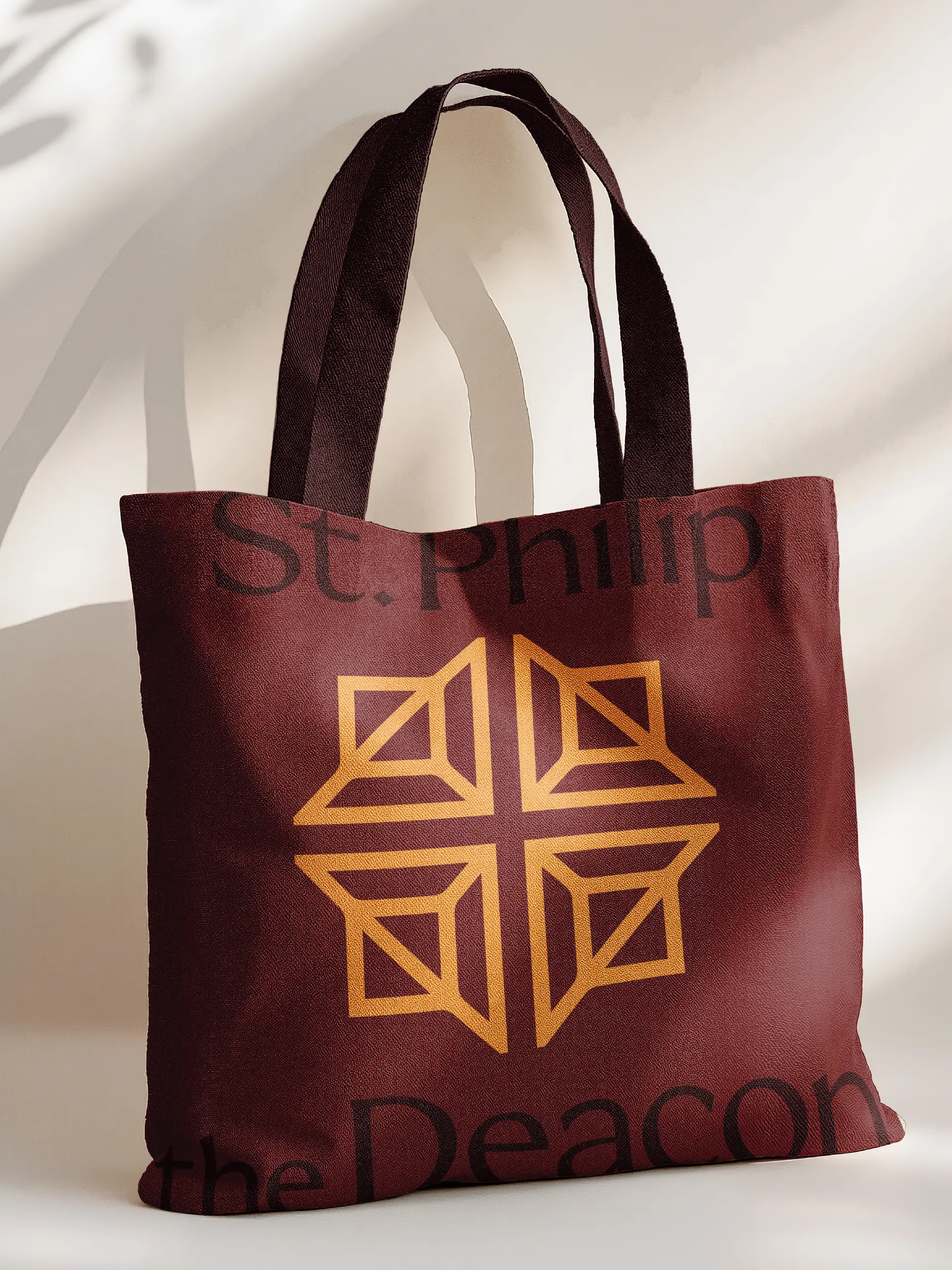
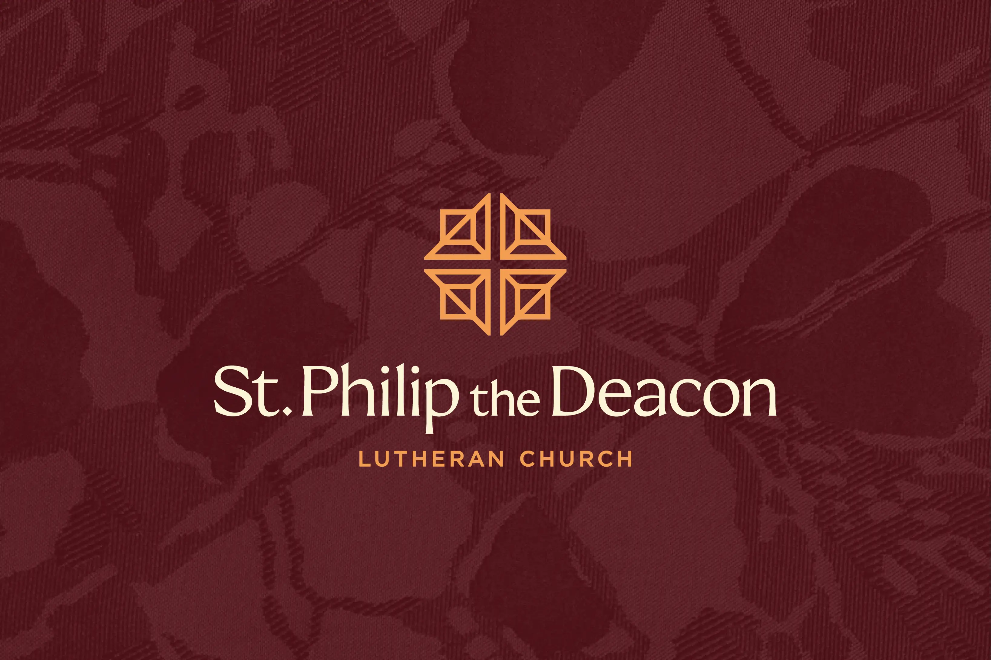
The first question was whether to keep a cross. They show up exactly as often as you expect they would in the church world, so the real work was making it St. Philip’s. Our first round built the icon from the geometry of the sanctuary skylight, the church’s stained glass, and a nod to the ELCA’s own mark.
Then, partway through, more archival material turned up: legacy crosses on altar kneelers and early brochures. Call it God’s providence, or the universe throwing us a bone, we’re grateful we came across it.
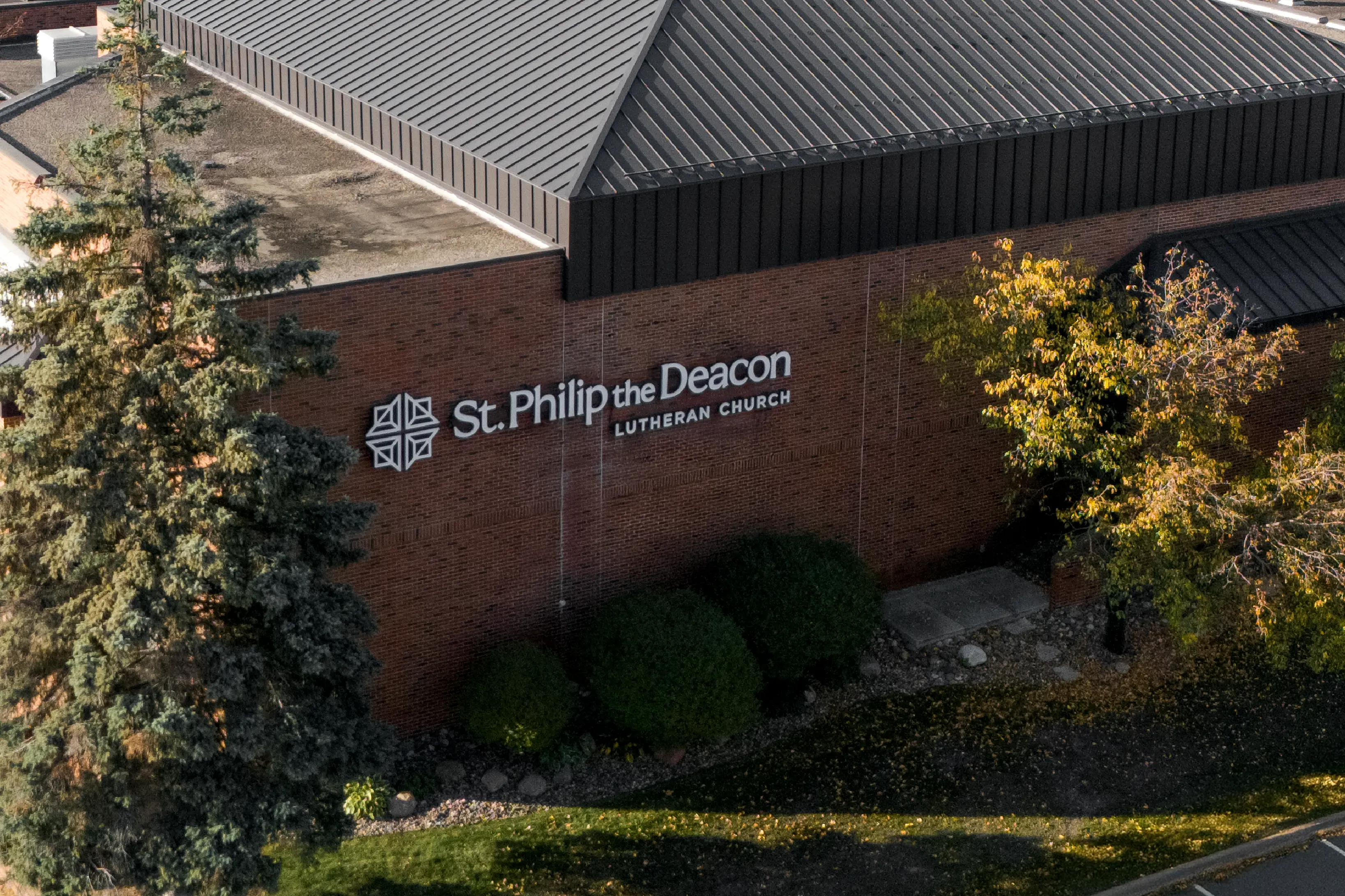
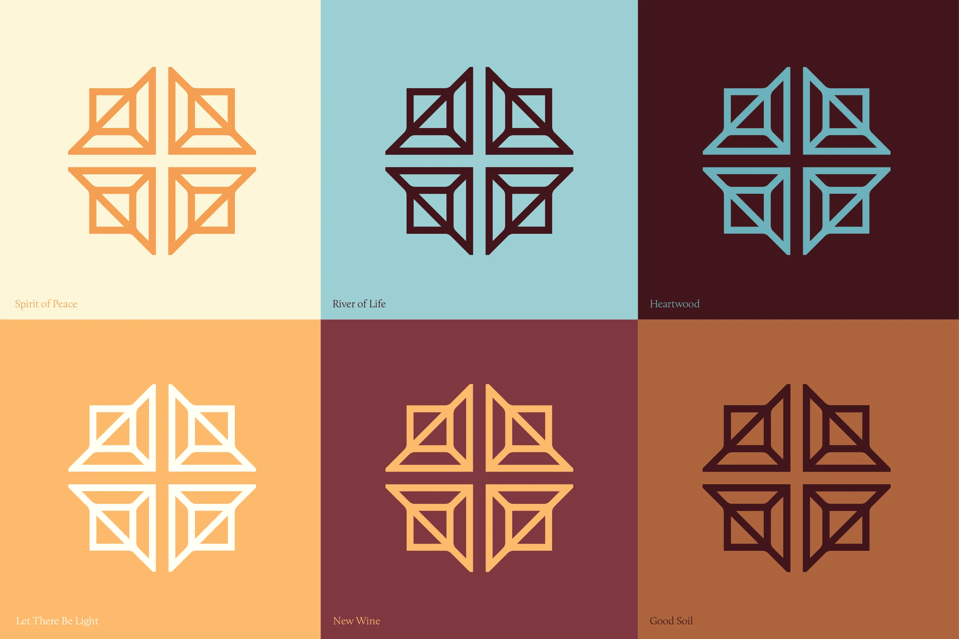
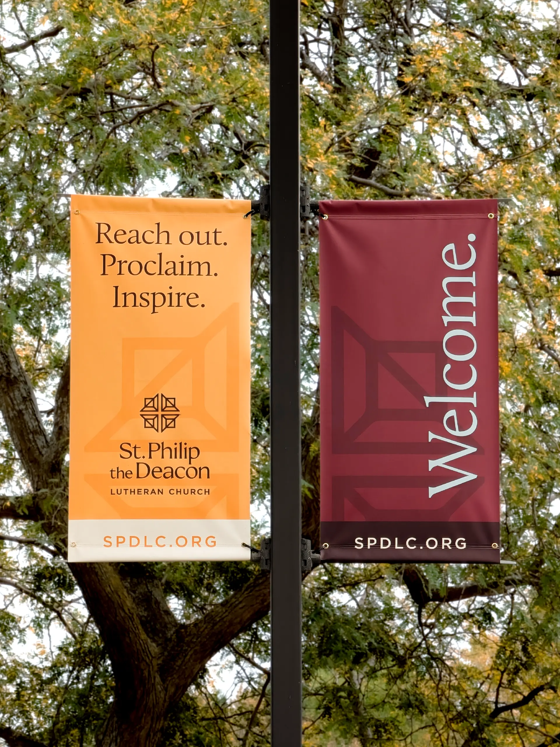
Those symbols took the place of the denominational reference, and the cross itself moved into the negative space between four skylight-shaped quadrants. In a church world of crosses galore—where keeping one in your logo runs counter to the branding instinct to stand out—this one was unmistakably and ownably St. Philip’s.
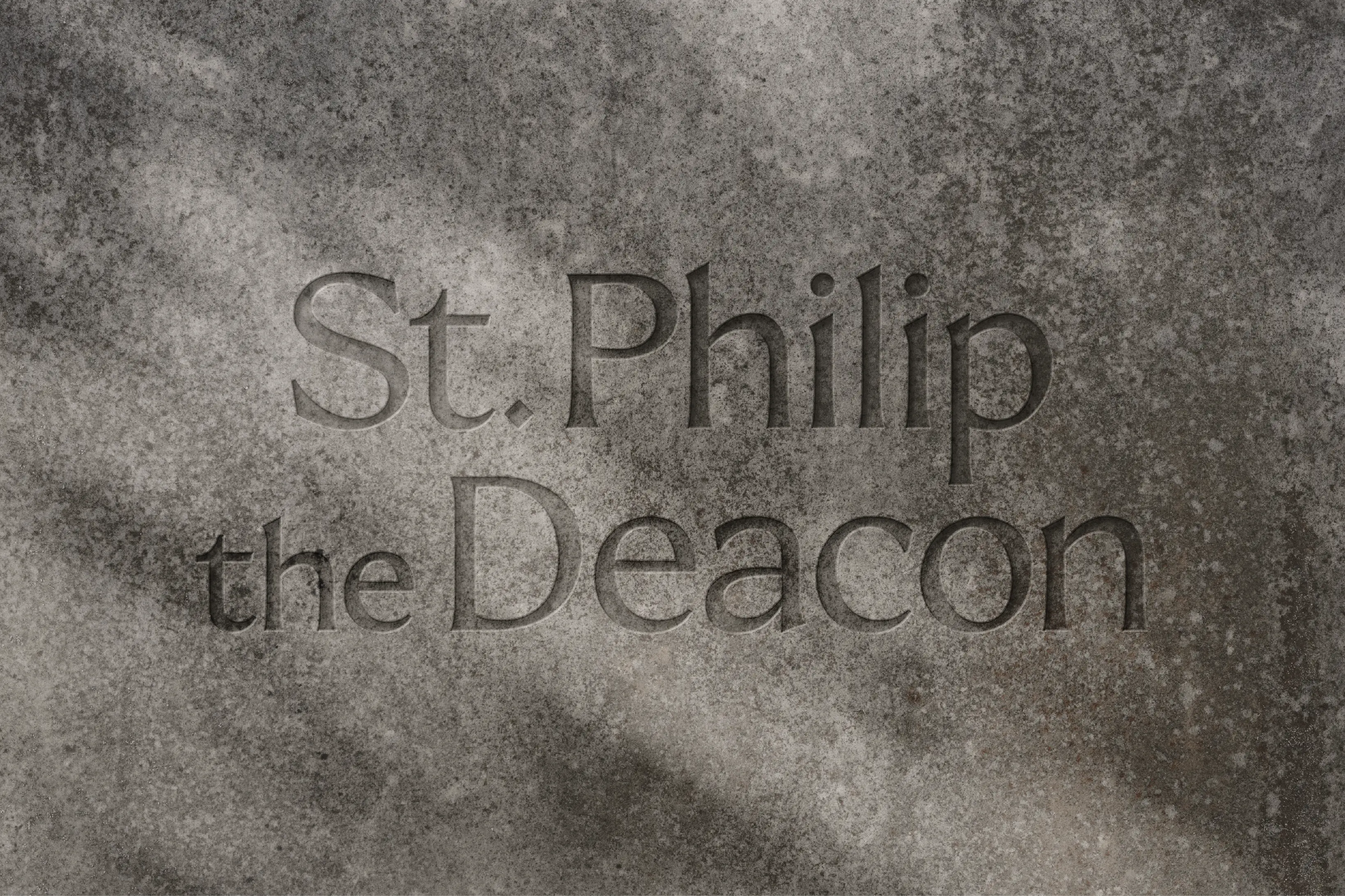
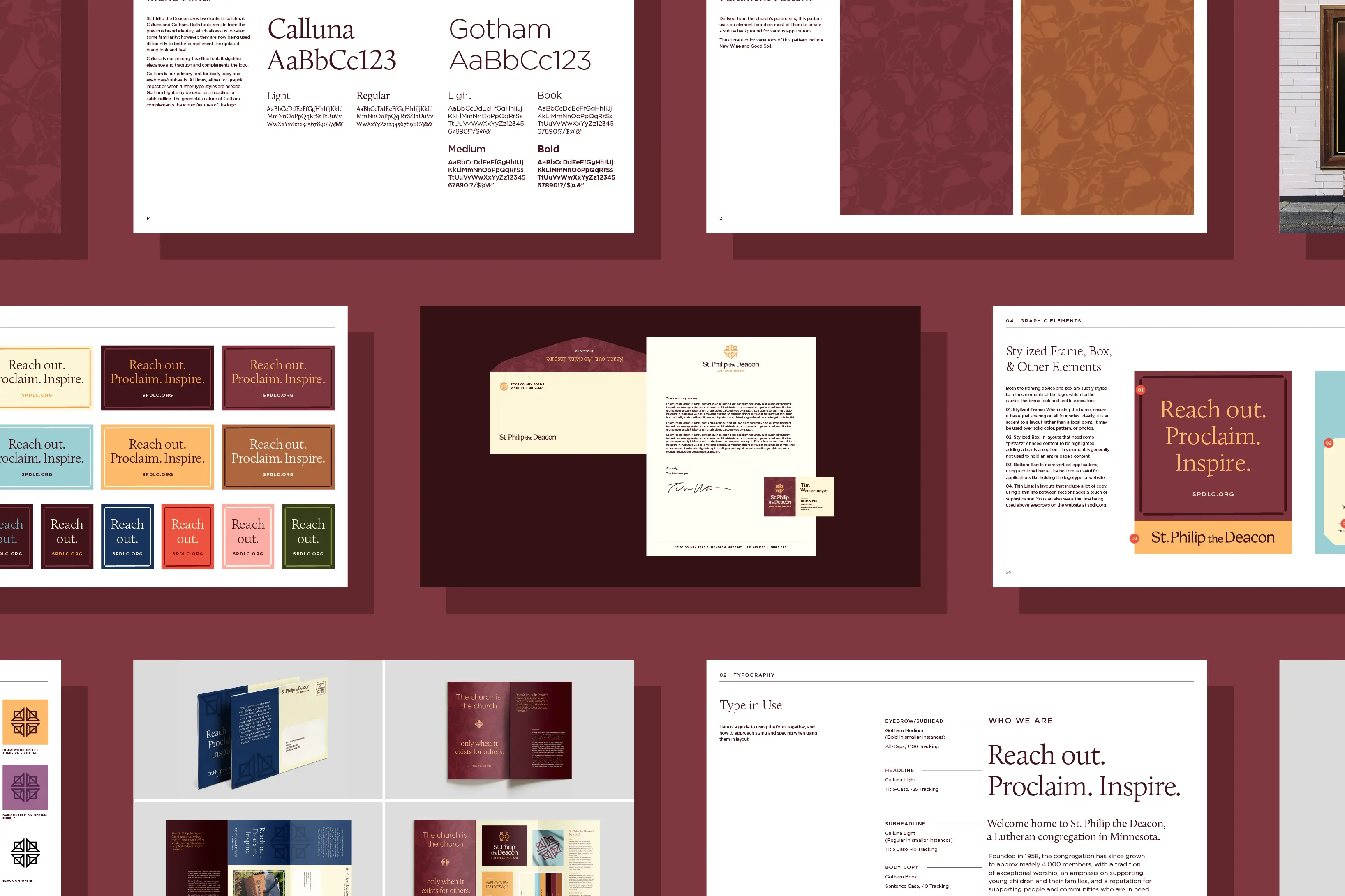
The ancient-modern tension played out in the logotype, with a traditional serif pairing with a contemporary sans. We iterated for a few rounds on new typefaces, but incumbents Calluna and Gotham won out for their simple sophistication and workmanlike usability. We did change their jobs around a bit, though, with Calluna Light leading headlines and Gotham doing the steady work underneath, and members get something familiar to hold onto while everything around it changes.
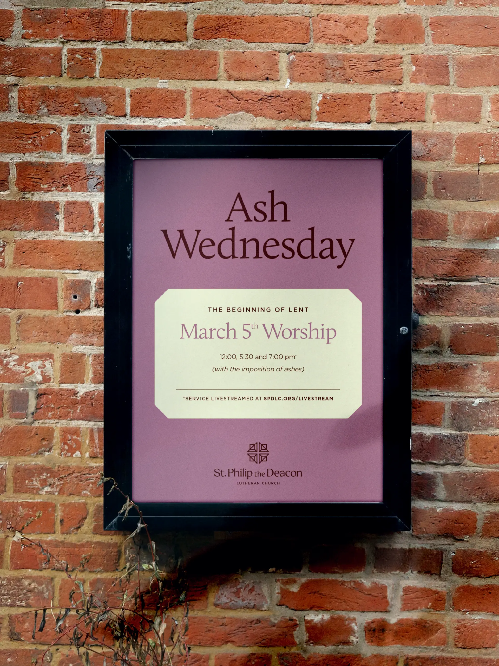
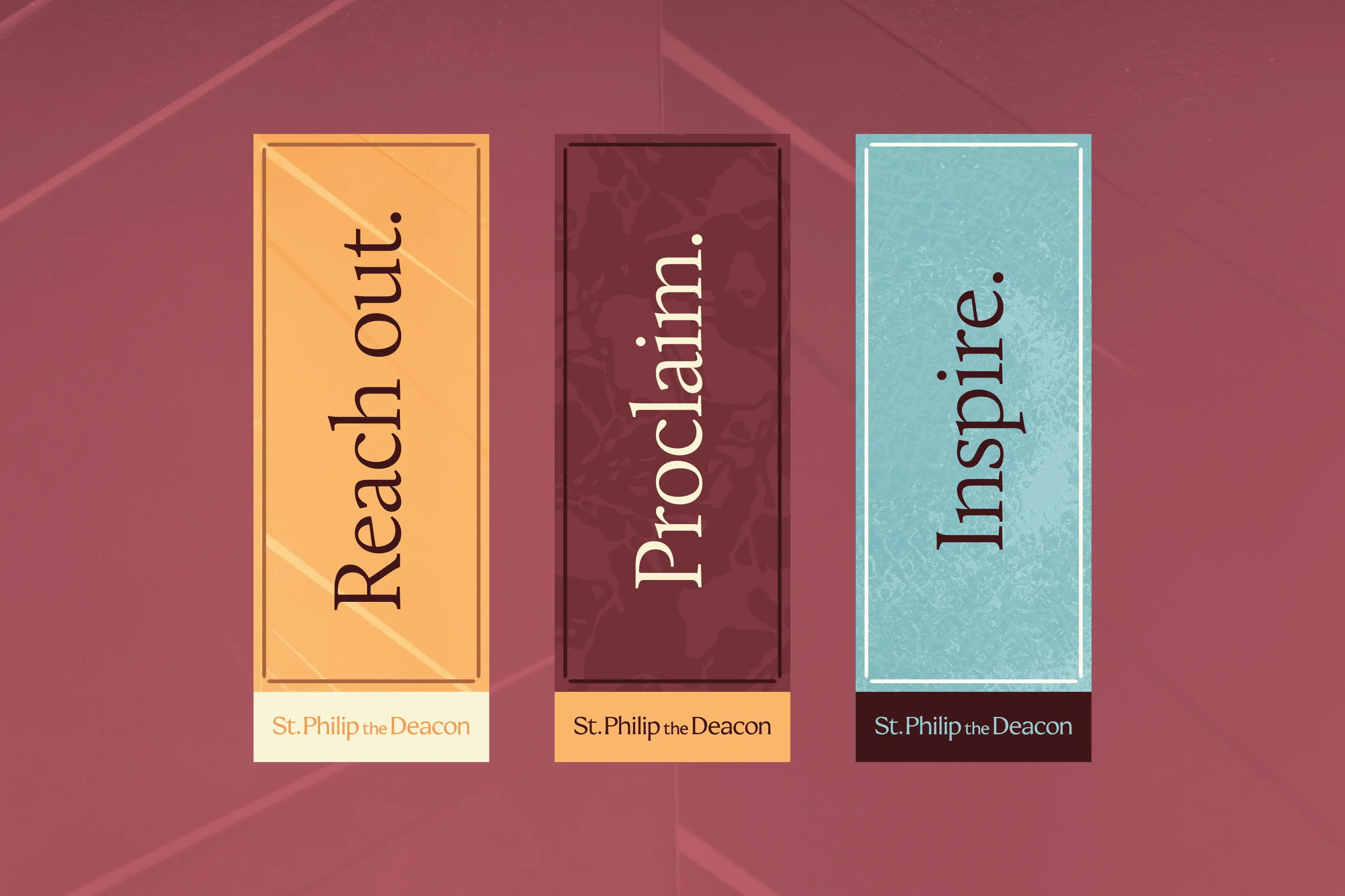
Color takes loose cues from the liturgical calendar. Warm orange, cream, deep burgundy, and soft blue anchor the palette, with reds, greens, and purples ready for the seasons. Each primary color carries a name from the Christian story, like Let There Be Light, River of Life, and New Wine, which gives staff a shared language that feels like theirs.
Then came the website, the all-important first impression for a church that signals to potential visitors whether they would belong there. Our copywriting assignment was modest but important, trimming it down to essentials and aimed at forming a connection with those potential visitors from the get-go.
Worship times sit right on the home page, sorted by style from contemplative to contemporary. Ministries are organized by age and stage under a simple promise: a place for everyone. Registration, giving, and the calendar connect to Planning Center, so regulars get where they’re going fast.
Conventional wisdom says that websites are funnels: you do what you can to pull the visitor down the chute until they take the action you design the site for. That’s largely wise, but our gut said it would be better if people experienced St. Philip the Deacon’s website like a virtual home tour. Leave space so imagination can breathe; select photos that highlight what’s most true; and tell the story about what it might be like to make the home yours.
Our friends at SPD are quote-mavens, and perhaps none ties a bow on it better than Lutheran hero Dietrich Bonhoeffer: “The church is the church only when it exists for others.” Whatever you make of church, SPD is one that’s existed in love for others all around for nearly 70 years, and we trust that their brand tees them up to do the same for the next 70.
“It’s become clear that the new solution is more elegant, sophisticated, and more fully reflects our warm and welcoming culture. We’re all very grateful to Malley’s team—not only for the refresh, but for the continued partnership.” – Tim Westermeyer, Senior Pastor, St. Philip the Deacon